Wood Floor Colour Trends for Refined Interiors
A wood floor sets the visual temperature of a room before furniture, paint or lighting have their say. Current wood floor colour trends favour believable, liveable tones over heavily stained looks: warmer natural oak, softly muted neutrals and selective use of rich brown are leading the direction. The right choice still depends on the room, daylight, use level and the wider material palette, particularly where wood meets tile, stone and joinery.
For homeowners, designers and commercial specifiers, the opportunity is to choose a floor with lasting character rather than chase a short-lived fashion moment. Colour matters, but so do grain variation, board format and finish. Together, they determine whether a floor feels calm and contemporary, classically elegant or suitably durable for a demanding entrance, kitchen or hospitality setting.
Wood floor colour trends moving into 2026
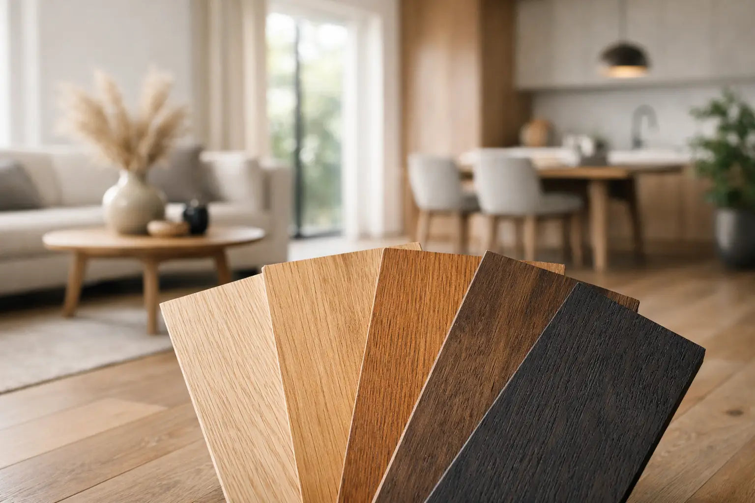
The move away from cold grey flooring continues. Grey has not disappeared altogether, especially in contemporary commercial schemes, but blue-based and heavily uniform greys can make an interior feel stark. In their place, designers are specifying wood colours with a more natural warmth: honeyed oak, biscuit, wheat, soft caramel and balanced mid-brown tones.
This is not a return to orange varnished timber. The most successful warm floors have restraint. They retain the variation found in real wood, with enough neutral undertone to sit comfortably alongside plaster finishes, natural stone, painted cabinetry and brushed metal details. A matt or low-sheen finish is usually essential to the effect, reducing glare and allowing the grain to do the work.
At the other end of the palette, dark wood is being used with more confidence, but in a considered way. Deep walnut, smoked oak and espresso-brown finishes bring definition and a sense of permanence to larger rooms, period properties, boutique retail spaces and hotel interiors. They are less forgiving of dust, pet hair and scratches than lighter alternatives, so a textured surface and a practical cleaning routine are worthwhile considerations.
Warm natural oak remains the dependable choice
Natural oak continues to be the most versatile direction for UK interiors. Its appeal lies in its ability to connect spaces without making a scheme feel overly matched. A warm, natural oak can sit beneath off-white cabinetry in a kitchen, complement aged brass in a bathroom-adjacent dressing area, or soften the cleaner lines of a contemporary extension.
Look for tones described as natural, light oak, raw oak, warm oak or golden oak, then assess a physical sample in the intended room. Product names are useful starting points, but photographs and screens cannot accurately show undertones. A floor that reads neutral in a showroom may appear more yellow beside a cool white wall, while one with subtle brown notes can look considerably warmer in south-facing light.
Natural oak is also commercially sensible. It gives a project broad appeal, works across changing furnishing styles and generally makes a practical choice where future resale value is part of the decision.
Soft neutral tones create a quieter backdrop
Pale woods are becoming more nuanced. Rather than whitewashed or distinctly grey finishes, the preference is for softened beige, sand, mushroom and putty-toned timber. These colours are particularly effective in spaces with limited daylight, where they can make the floor feel light without the hard contrast of a very pale surface.
A neutral floor is not automatically low maintenance. Very pale boards can show marks around entrance doors and busy kitchen zones, while an overly flat, uniform finish may expose every scuff. Choosing a floor with gentle tonal movement, natural knots and a brushed texture gives the surface more visual forgiveness. In family homes, that balance often looks better for longer than a pristine-looking white finish.
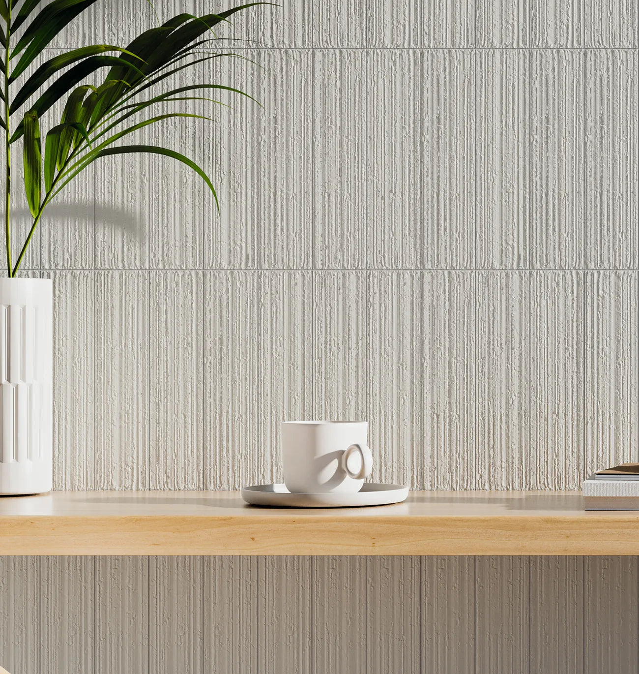
These shades are especially useful when a project includes stone-effect porcelain, limestone-look tiles or warm white ceramic wall tiles. They create continuity between rooms while allowing each surface to retain its own texture and purpose.
Mid-brown floors are returning with depth
For several years, many schemes avoided brown altogether in favour of pale Scandinavian-inspired finishes. Mid-brown is now firmly back, though the modern version is more layered and less red. Think toasted oak, tobacco, chestnut and lightly smoked finishes with visible grain and tonal variation.
A mid-brown floor can anchor an open-plan room with high ceilings or extensive glazing, preventing the interior from feeling washed out. It also provides a useful counterpoint to pale painted walls and cream or taupe upholstery. In heritage homes, it often feels more appropriate than a bleached board, particularly where original joinery, fireplaces or exposed beams are retained.
The trade-off is visual weight. In a narrow north-facing hallway or a small room with limited natural light, a dark mid-brown may feel enclosing. Board direction, lighting and wall colour can offset this, but a sample laid flat on site remains the safest way to judge the effect.
Choosing the right colour for the room
A fashionable colour is only successful when it supports how the space is used. Hallways, kitchens and living areas encounter different levels of traffic, moisture risk and natural light, so one shade may not be the right answer everywhere.
Light levels and orientation
North-facing rooms receive cooler light, which can amplify grey or green undertones in timber. Warm natural oak and balanced beige tones usually bring more comfort to these spaces. South-facing rooms can handle paler, cooler or deeper colours, although strong sunlight can make warm floors appear more golden at certain times of day.
Artificial lighting should also be assessed. Warm LED lighting enriches oak and brown tones, while cooler lighting can flatten them. View samples in morning, afternoon and evening conditions before finalising a specification.
Room size and flow
A lighter floor can help a compact room feel more open, but it need not be pale to achieve that result. A consistent mid-tone floor with a matt finish can create just as much visual flow, especially when continued through adjoining living areas. Keeping the same floor throughout a ground floor is often more effective than changing colours between rooms.
In larger rooms, darker timber can define seating and dining zones without adding another material. Wide boards enhance that sense of scale, while narrower planks can suit period properties and smaller spaces where a more traditional rhythm is appropriate.
Everyday maintenance and performance
Colour should be selected alongside construction and finish. Brushed, textured and matt wood floors tend to disguise everyday wear better than smooth, glossy surfaces. This matters in homes with children and pets, as well as commercial interiors with regular footfall.
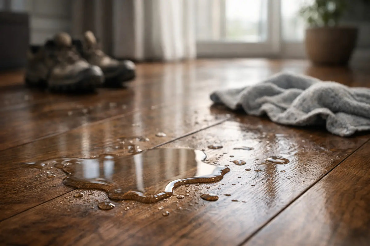
For kitchens, entrance areas and projects where moisture exposure is a concern, consider whether engineered wood or a wood-effect porcelain floor is the more suitable route. Porcelain can deliver the warmth of current timber colours with greater water resistance and straightforward maintenance. In wet rooms, it is generally the practical specification, while real wood can be reserved for adjoining spaces to maintain a coherent palette.
Finish, grain and board size affect the final colour
The same stain can look entirely different across two products. A smooth satin board reflects more light and can appear lighter or more uniform, whereas a brushed matt finish absorbs light and makes the grain feel more pronounced. Smoked treatments, reactive stains and fumed effects introduce depth that changes across each plank, creating a more bespoke result.
Natural grade boards with knots, mineral streaks and colour variation suit relaxed contemporary interiors and country properties. Select-grade boards are cleaner and more consistent, making them useful in minimal schemes or formal commercial settings. Neither is inherently better. The decision is about the level of movement the room needs.
Board width plays a similar role. Wide planks make soft neutral and natural oak colours feel generous and architectural. Herringbone or chevron patterns introduce pattern and shadow, so they are often most successful in a restrained colour rather than a heavily distressed or very dark finish. If using a patterned floor, allow the grain and layout to remain the feature.
How to specify with confidence
Begin with samples, not only a digital moodboard. Place them next to cabinetry, wall finishes, worktops and any nearby tile, then view them under the room's actual light. Ordering enough samples to compare two or three realistic options is usually quicker and less costly than revisiting a decision after installation has begun.
It is also sensible to order the floor, underlay or adhesive system, trims and finishing products as one considered package. Confirm the subfloor condition, moisture levels, compatible underfloor heating system and expansion requirements before selecting a product. A premium floor needs a suitable base and installation method to perform as intended.
At Smart Tiles, showroom guidance and product samples can help narrow a broad colour choice to a finish that works with the full surface scheme. For larger projects, ensure quantities include an appropriate allowance for cuts, layout and future repairs, particularly with herringbone designs or boards with pronounced natural variation.
The best floor colour is one that still feels right after the paint, furniture and seasons change. Choose a tone that responds well to the light you have, a finish that suits the traffic you expect, and enough natural variation to give the space a finish with genuine staying power.