Warm Neutral Tiles for Lasting Interior Style
A room can feel expensive without looking over-designed. That is the appeal of warm neutral tiles: they bring softness, depth and a considered finish to hard-working spaces, while leaving room for timber, brassware, paint and textiles to do their part. Rather than reading as simply beige, the best warm neutrals have undertones of sand, oatmeal, putty, clay, mushroom or gentle taupe.
For a renovation that needs to stay relevant beyond one trend cycle, warm neutral surfaces are a highly dependable starting point. The key is choosing the right undertone, format and finish for the light, scale and practical demands of the room.
Why warm neutrals work so well
Warm neutrals sit between the crispness of cool grey and the stronger visual commitment of terracotta, green or blue. They make bathrooms feel calmer, kitchens less clinical and hallways more welcoming, particularly in British homes where natural daylight can be limited for much of the year.
They are also flexible enough for different design directions. Pair a pale stone-effect porcelain with pale oak and brushed nickel for a relaxed contemporary scheme. Introduce walnut, aged bronze and fluted glass for a more tailored look. A clay-toned ceramic wall tile can also give a kitchen or cloakroom a softer, more decorative character without overwhelming the space.
That flexibility should not be confused with a lack of personality. A warm neutral tile has colour in it. Its effect depends on whether that colour leans yellow, pink, red, green or grey, and those undertones become much clearer once a larger area is tiled.
Start with undertone, not the sample name
Names such as ivory, cream, beige and taupe are useful guides, but they are not a specification. Two tiles described as beige can look entirely different in the same room: one may have a buttery yellow cast, while another may feel grey-brown and restrained.
Take samples into the space and look at them against fixed finishes such as worktops, cabinetry, sanitaryware and flooring. View them in morning light, on an overcast afternoon and under the artificial lighting planned for the room. A tile that appears softly neutral in a bright showroom can become noticeably pink, yellow or dull in a north-facing bathroom.
For a quiet, layered interior, keep the undertones aligned. Sand, limestone, oat and pale timber generally sit comfortably together. If the room includes strong orange-toned oak or a cream worktop with yellow veining, a cooler mushroom tile may look disconnected rather than balanced.
There is no requirement for every finish to match exactly. In fact, a scheme usually looks more natural when there is a gentle shift between wall, floor and joinery. The aim is a shared warmth, not a single flat shade throughout.
Choosing warm neutral tiles by room
Bathrooms: build depth without making the room smaller
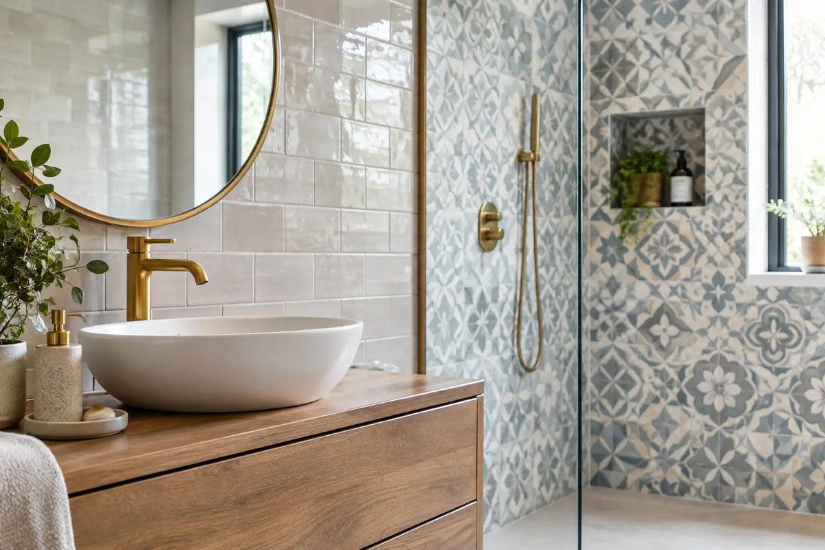
Warm neutral porcelain is particularly effective in bathrooms because it softens the contrast between white sanitaryware, glass and chrome. Large-format stone-effect tiles with a matt finish can create a composed, spa-like result on floors and walls, with fewer grout joints to interrupt the surface.
In compact bathrooms, a lighter warm neutral will generally reflect more light than a deeper clay or mushroom tone. That does not mean dark tiles are off limits. A deeper floor with lighter walls can ground the room, while a feature shower area in a richer neutral adds focus. Consider tile size carefully: large formats can make a small room feel less busy, but they also require sound setting-out and may produce more cuts in awkward layouts.
For wet areas, select a floor finish with suitable slip performance rather than choosing solely by appearance. A polished tile may suit a wall beautifully but is rarely the practical choice for a shower floor or frequently used family bathroom.
Kitchens: connect surfaces and joinery
A warm neutral splashback can bridge painted cabinetry and a stone or composite worktop. Small-format ceramic tiles, including brick, square and gently textured options, bring variation and light play to a kitchen without demanding a bold colour statement.
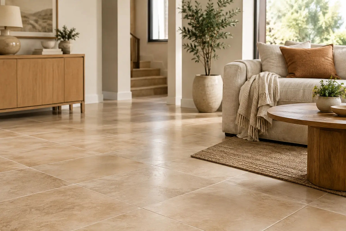
If the floor is being tiled, porcelain offers the durability required for busy kitchens, pets and regular cleaning. Stone-effect designs are often a strong choice where the look of natural limestone is wanted with lower maintenance and greater consistency. Choose a format that suits the room proportions: planks can lead the eye through a galley kitchen, while larger rectangular tiles can give an open-plan space a more continuous feel.
Avoid treating grout as an afterthought. A close tonal grout gives a calmer, more expansive appearance. A contrasting grout makes each tile shape more prominent, which can be attractive with a handmade-look wall tile but may make a large floor feel busier than intended.
Hallways and living spaces: specify for traffic
Entrance halls need surfaces that can cope with grit, moisture and daily footfall. A warm neutral porcelain floor is practical here because it disguises light dust better than very dark or very pale finishes, while still giving the first room of the house a refined, welcoming character.
Consider a matt or lightly textured finish for traction, especially where the entrance is regularly exposed to wet shoes. A stone-effect porcelain in a mid-warm neutral can continue from a hallway into a utility or kitchen, helping adjoining spaces feel connected. For larger installations, check that the tile is suitable for the substrate and the intended setting materials before finalising quantities.
Format and finish change the final effect
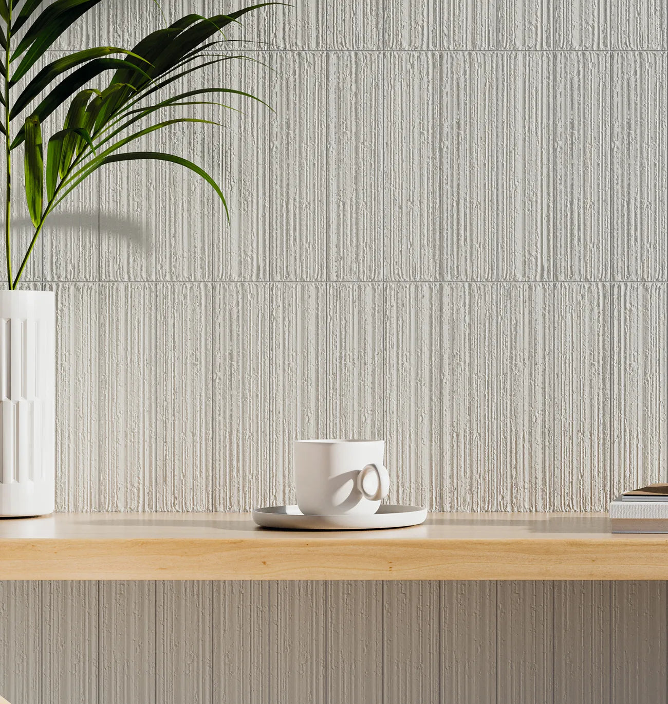
The same colour can feel minimal, rustic or architectural depending on its format and surface. Large-format porcelain reduces visual interruption and suits clean-lined, contemporary interiors. A smaller modular format introduces rhythm and works well in period properties, cloakrooms and decorative kitchen areas.
Veining and variation deserve the same attention. A lightly varied stone-effect tile offers depth while remaining easy to live with. A tile with dramatic movement can be striking across a large open floor but may compete with patterned worktops, timber grain or busy furnishings. Always lay several samples together where possible, as a single piece cannot show the full range of a multi-face design.
Matt finishes are increasingly popular for warm neutral floors because they feel natural and tend to conceal everyday marks well. Satin and gloss finishes reflect light more strongly and are useful on walls, particularly in smaller or darker rooms. Neither is inherently better - the right choice depends on the room's use, cleaning expectations and the level of visual texture already present.
Plan the installation as part of the selection
A premium tile can only perform as well as its installation allows. Before ordering, confirm the dimensions of the tiled area, include sensible wastage for cuts and layout, and check whether the substrate is suitable. Floors may require preparation, levelling or decoupling, while wet zones need the correct waterproofing system.
Tile size affects this planning. Large porcelain tiles require a flat substrate and appropriate adhesive coverage, while smaller formats may take longer to fix and grout. Rectified edges can support narrower grout joints, but joints are still necessary and should never be eliminated altogether. Movement joints also need to be considered in larger areas and where tiles meet different materials.
Matching adhesive, grout, trims, levelling systems and sealants to the project reduces avoidable delays on site. This is especially relevant for commercial and multi-room residential projects, where a late change in material or an overlooked accessory can affect the programme. Smart Tiles can support the process with samples, coverage guidance and the installation materials needed to specify the surface as a complete system.
A palette that will still feel right in years to come
Warm neutrals work best when they are allowed to be quietly confident. Choose a tile with enough tonal character to avoid looking flat, then build contrast through texture: natural timber, linen-finish cabinetry, metal fittings, painted plaster or a darker grout line where appropriate.
If you are deciding between two shades, bring both samples home and give them time. The right warm neutral tile should look settled in the room at every hour, not just impressive under showroom lighting. That confidence is what turns a practical wall or floor finish into a surface you will be pleased to live with for years.