Warm Neutral Flooring Trends for Refined Homes
A floor can make a newly designed room feel considered or leave it feeling slightly disconnected. Warm neutral flooring trends are proving particularly effective because they bring softness to contemporary interiors without limiting the choice of cabinetry, paint, furniture or fittings that sit around them. For homeowners, designers and commercial specifiers, the appeal is clear: these finishes feel current, but are not tied to a short-lived colour moment.
The strongest schemes are moving away from cool grey and stark white towards colours with a gentle warmth. Think oatmeal, sand, putty, biscuit, mushroom, soft taupe and pale honeyed oak. These shades create a calm foundation while retaining enough depth to handle the practical demands of a busy hallway, kitchen, bathroom or hospitality setting.
Why warm neutral flooring is defining current interiors
Warm neutrals work because they make a space feel more inviting without becoming dominant. A light beige porcelain floor can lift a north-facing kitchen; a mid-tone stone-effect tile can give an open-plan living area greater visual weight; a natural oak floor can balance sleek joinery and darker metal finishes.
This direction also responds to the way interiors are now designed. Many projects combine textured plaster finishes, timber details, aged brass, linen, natural stone and tactile upholstery. Flooring needs to support those materials rather than compete with them. A well-chosen neutral surface gives the scheme continuity from room to room and allows feature elements to change over time.
There is a practical advantage, too. Very pale white floors can show everyday marks, while deep charcoal and black finishes often reveal dust and residue. Mid-light warm neutrals are generally more forgiving, especially when a natural variation, wood grain or stone pattern is part of the design.
Warm neutral flooring trends to specify now
Soft stone-effect porcelain
Stone-effect porcelain in limestone, travertine and light sandstone shades is one of the most adaptable choices for modern UK homes. The look is relaxed and natural, yet porcelain offers low porosity, straightforward maintenance and dependable performance in areas where real stone may require more ongoing care.
Large-format tiles are particularly popular in open-plan kitchens, dining spaces and ground-floor extensions. Fewer grout joints create a cleaner, more expansive finish, while subtle tonal movement prevents the floor from appearing flat. For bathrooms, a matt or structured surface should be selected with slip resistance and the intended wet-area use in mind.
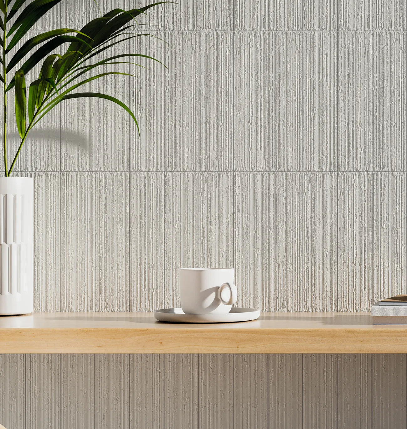
Travertine-effect designs are gaining attention for their gentle linear texture and creamy, mineral-based tones. They work especially well with warm white walls, walnut furniture and brushed brass. The most successful versions are not overly orange or heavily patterned. Look for a refined variation that reads as natural from a distance and rewards closer inspection.
Beige and greige concrete looks
Concrete-effect flooring has not disappeared; its colour palette has simply become warmer. Instead of blue-grey finishes, current collections are introducing almond, clay, taupe and greige interpretations. These offer the architectural quality of concrete while making a room feel less severe.
This is a useful option for contemporary homes, retail spaces and restaurants where a clean, restrained backdrop is required. The trade-off is that concrete-effect surfaces can feel visually cool if paired only with white cabinetry and chrome. Introduce timber, textured fabrics or warmer metal finishes to bring balance to the overall scheme.
Natural oak and soft brown wood flooring
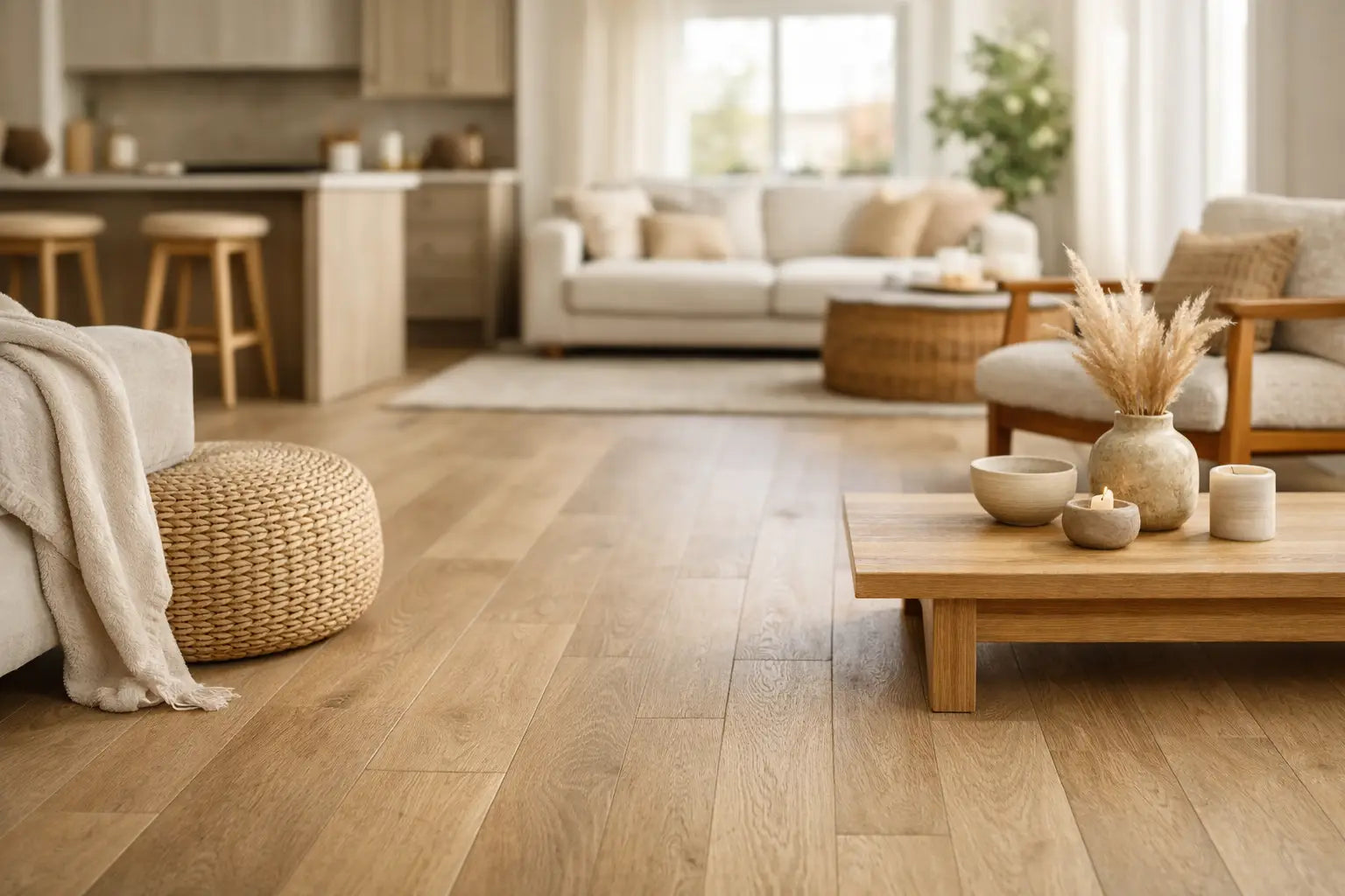
Wood flooring is also moving towards natural, lightly warmed tones. Pale oak remains a reliable choice, but the preference is for boards with visible grain, subtle knots and a less uniform appearance. Smoked beige oak, light brown oak and gently brushed finishes bring character without the heaviness of traditional dark timber.
Wider planks can make larger rooms feel composed and luxurious, while herringbone and chevron formats introduce detail in hallways, reception spaces and formal living rooms. Patterned wood flooring has a strong decorative presence, so it is often best paired with simpler cabinetry and quieter wall finishes.
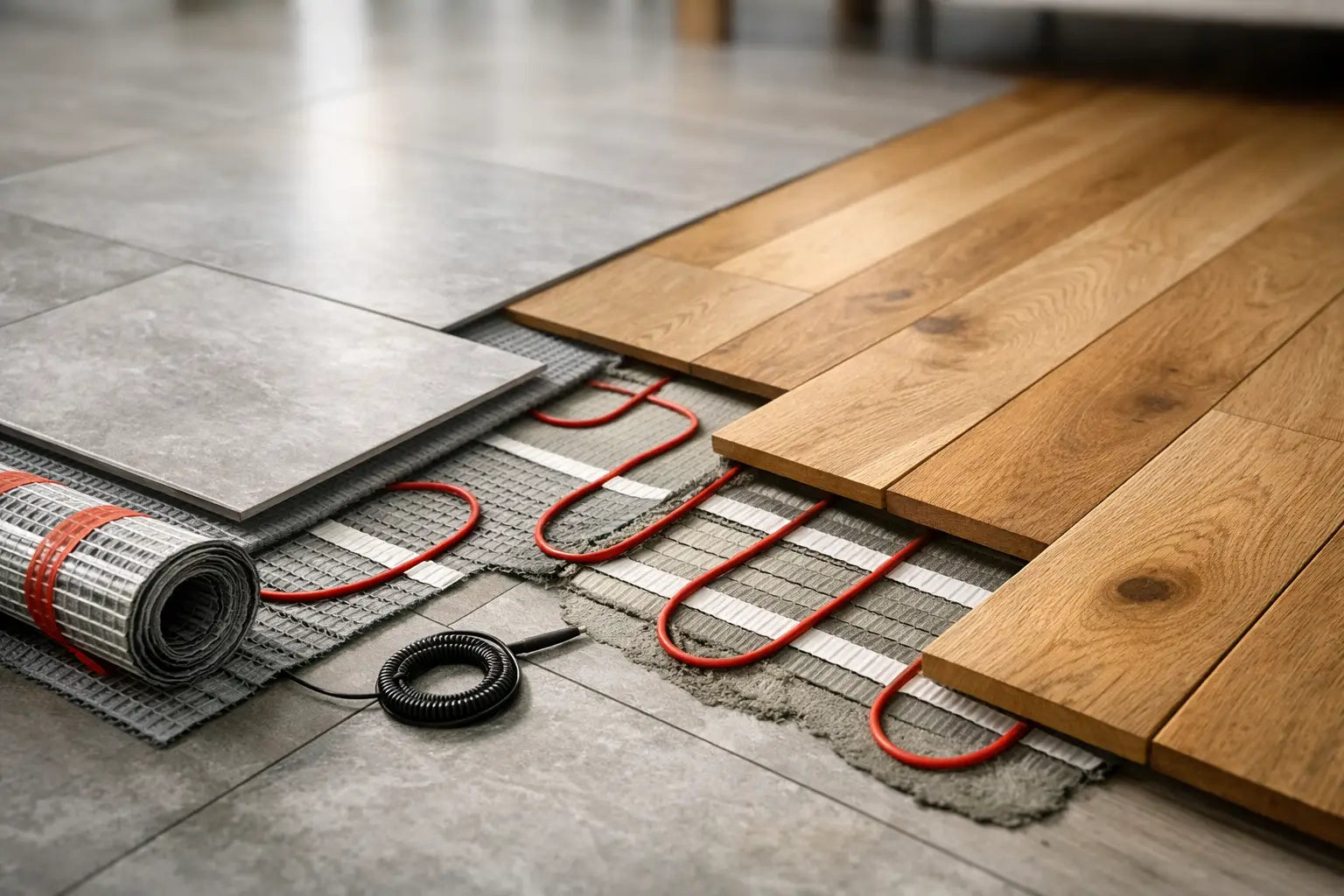
The right construction matters as much as the colour. Engineered wood is often a practical choice where stability is needed, particularly across larger areas or where underfloor heating is planned. Always confirm the flooring manufacturer's suitability guidance, the subfloor condition and the correct adhesive or underlay before finalising a specification.
Handmade-inspired ceramic and porcelain tiles
For smaller spaces, warm neutral flooring does not have to mean plain large-format tiles. Square, brick and encaustic-inspired formats in chalky beige, muted terracotta and soft cream can introduce a more crafted feel. These designs are well suited to cloakrooms, utility rooms, boot rooms and independent hospitality spaces where the floor can carry more personality.
A handmade look should still be carefully proportioned. Strong shade variation may be exactly right for a character-led renovation, but less suitable for a minimal kitchen with precise, contemporary detailing. Viewing several tiles together is essential, as a single sample may not show the full colour movement of the finished floor.
Choosing the right undertone for your room
The term warm neutral covers a broad range of colours, and undertone is where many flooring decisions are won or lost. Beige with a pink or peach cast can feel very different beside a yellow-toned oak cabinet. Greige may work beautifully with polished nickel but look cooler next to cream stone worktops. The aim is not to match every surface exactly, but to make the key materials feel intentional together.
In rooms with limited natural light, choose a lighter warm neutral with a gentle reflective quality. Matt tiles are often preferred for their understated appearance, though a satin or lightly textured finish may give a little more light movement. In bright south-facing rooms, a mid-tone clay, taupe or natural oak can prevent the scheme from becoming washed out.
For a connected ground floor, consider whether the same flooring can continue through the kitchen, dining area, hallway and utility room. A consistent porcelain tile gives visual flow and can make smaller houses feel more generous. Where wood is preferred in living areas and tile is required in wetter zones, select finishes with related warmth rather than trying to imitate each other exactly.
Format, grout and finish make the difference
Tile size, laying pattern and grout choice all affect how a warm neutral floor reads once installed. Large rectangular porcelain tiles laid in a simple staggered or straight pattern give a calm, contemporary result. Smaller formats or modular stone-effect layouts create more texture and can suit period properties or spaces needing stronger definition.
Grout should support the tile rather than create an unintended grid. A closely matched grout gives a more continuous appearance, while a slightly deeper shade can define a handmade-style tile or patterned layout. Very pale grout may look crisp on installation day but can demand more cleaning in entrance areas, kitchens and commercial settings.
Finish is equally important. Polished porcelain can add glamour and reflect light, but it is not always the most practical choice for a family kitchen or wet bathroom floor. Matt porcelain, brushed wood and textured stone-effect designs tend to offer a more forgiving, tactile surface. For commercial projects, slip resistance, cleaning regimes and expected footfall should be considered alongside the visual brief.
Plan the installation before ordering
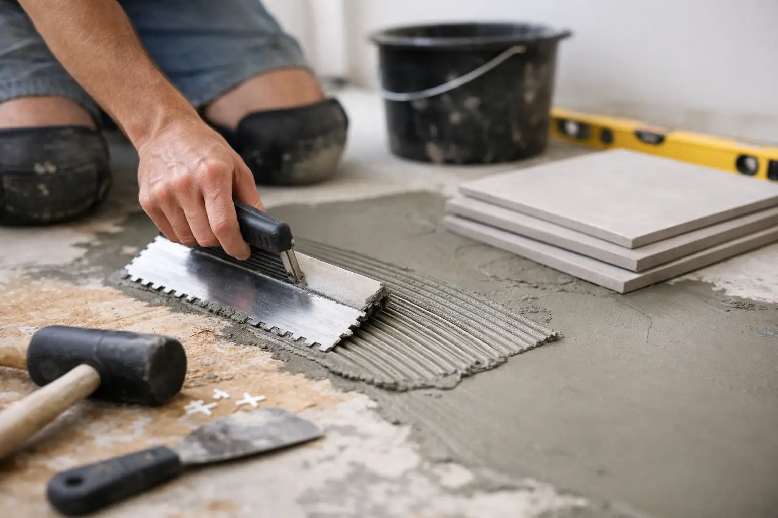
A premium floor performs best when the preparation and installation system are specified correctly. Check the subfloor for flatness, moisture and suitability before selecting the finish. Large-format porcelain may require levelling work and a suitable flexible adhesive, while timber floors need appropriate acclimatisation, expansion allowances and a compatible fitting method.
It is also sensible to order samples and view them in the actual room at different times of day. Lighting changes colour perception considerably, particularly with warm neutrals. Place samples beside cabinetry, paint, worktops and fabric swatches rather than assessing them in isolation.
When calculating quantities, include a realistic allowance for cuts, pattern matching and future repairs. Straightforward layouts may need less additional material than herringbone, diagonal or feature-border designs. Matching trims, grout, movement profiles, adhesives, boards and sealers should be chosen at the same time, so the installation is not delayed by missing components.
Smart Tiles can help bring these decisions together with design-led tile and wood flooring collections, samples and the practical installation materials needed to complete a project professionally. The most enduring warm neutral floor is not simply the one that looks right in a photograph. It is the finish whose tone, format and technical specification continue to suit the way the space is used every day.