Porcelain Floor Tile Colours for Every Room
A floor can look entirely different once daylight moves across it, kitchen lights are switched on or a hallway is viewed against painted joinery. That is why choosing porcelain floor tile colours is about more than selecting a shade from a sample board. The right choice needs to work with the room’s natural light, proportions, adjoining finishes and the level of day-to-day use.
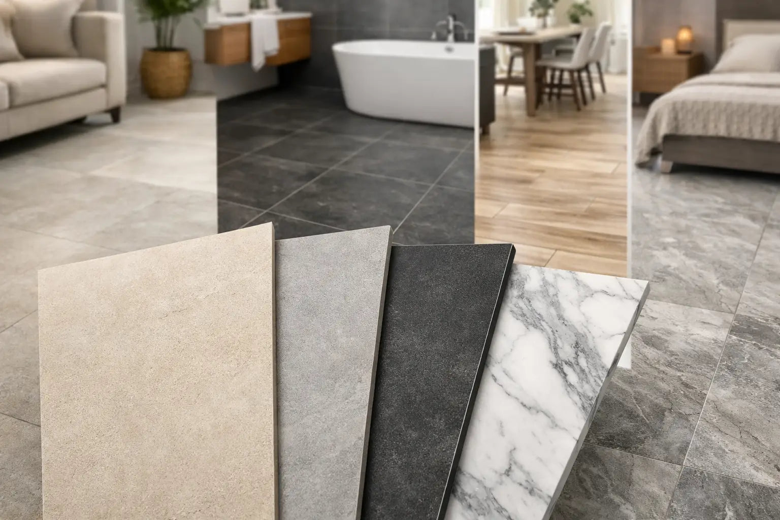
Porcelain offers an especially broad palette, from quiet limestone beiges and soft greys to expressive marbles, warm timber effects and deep contemporary charcoals. It is a practical material for busy homes and commercial interiors, but the most successful scheme starts by understanding how colour, format and finish will perform together.
Start with the room, not the trend
A trend can provide useful direction, but a floor is a long-term surface. Before narrowing down a colour, consider the amount and direction of natural light, whether the room connects to other spaces, and the visual weight of fixed features such as cabinetry, sanitaryware and fireplaces.
North-facing rooms often benefit from warmer porcelain tones. Ivory, sand, biscuit and pale taupe tiles can counteract cool daylight without making a space feel overtly yellow. In bright south-facing rooms, cooler greys, stone shades and muted concrete effects can appear calm and refined. The same grey tile may look blue in one room and softly neutral in another, so viewing samples in the intended space is essential.
In open-plan layouts, the floor frequently becomes the unifying element. A consistent porcelain tile colour across the kitchen, dining and living areas can make the footprint feel more generous and composed. If separate zones are required, change the tile format, laying pattern or rug placement before introducing a contrasting floor colour. Too many transitions can make a considered scheme feel fragmented.
Porcelain floor tile colours and undertones
The undertone is often more important than the headline colour. A beige porcelain tile may lean pink, yellow, grey or green, while greys can be warm, blue-based or almost brown. These subtleties determine whether the floor sits comfortably alongside wall paint, timber, brassware and worktops.
Warm neutrals for relaxed, timeless interiors
Sand, putty, mushroom, biscuit and limestone-effect porcelain are dependable choices for homeowners seeking warmth without a strong colour statement. They work particularly well with oak cabinetry, natural timber flooring in adjoining rooms, brushed brass and off-white walls.
Warm neutral tiles are also forgiving in family kitchens and hallways. Fine dust and everyday marks tend to be less apparent than on very pale plain tiles or dense black surfaces. For a more premium result, look for porcelain with gentle tonal variation rather than a completely flat printed background. The movement should be believable at full floor scale, not busy or repetitive.
Grey porcelain: choose warmth carefully
Grey remains a useful architectural neutral, particularly in contemporary kitchens, utility rooms and commercial spaces. However, cool mid-grey can feel austere when paired with grey cabinetry, white walls and limited daylight. If the brief calls for grey but the room needs softness, choose a greige, cement-grey with a warm cast, or a stone effect with beige veining.
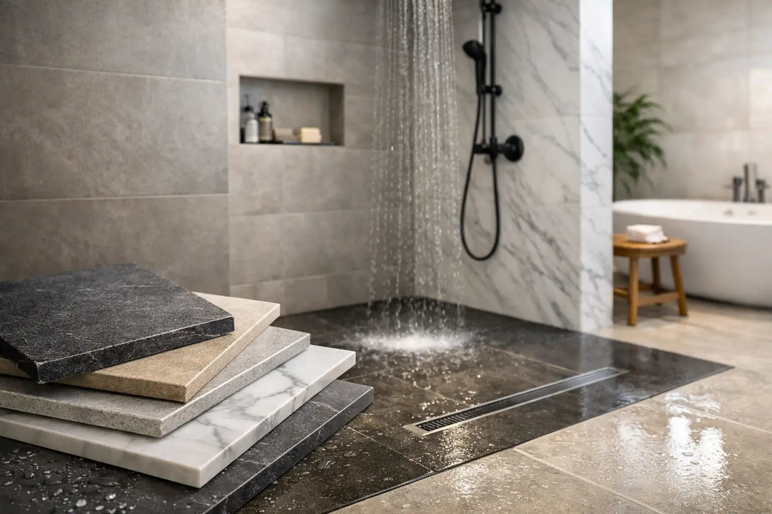
Pale grey porcelain can make a compact bathroom feel clean and open, while mid-grey offers a practical base for entrances and high-traffic floors. Deep graphite is striking, but it needs space, considered lighting and regular cleaning to retain its intended appearance. In small rooms, it is often more effective as an accent wall or shower enclosure than as the dominant floor.
White and pale tiles: light, but not always low-maintenance
White porcelain floor tiles create a crisp, expansive look, especially in modern bathrooms and kitchen extensions. A softened white with a stone, marble or terrazzo effect is usually easier to live with than brilliant plain white. It introduces depth and disguises minor everyday debris more effectively.
Pale floors reflect light, but they can also reveal dark grout staining, scuffs and mud near external doors. A carefully selected grout colour is part of the design, not an afterthought. For most pale porcelain floors, a closely matched light grey or warm neutral grout gives a more practical, cohesive result than pure white.
Dark colours for definition and contrast
Charcoal, black, dark brown and deep blue-grey porcelain bring presence to larger kitchens, cloakrooms, hotel reception areas and design-led retail environments. They can frame pale walls and light joinery beautifully, particularly in large-format tiles with a matt stone or concrete finish.
The trade-off is visibility. Limescale, dust, pet hair and water spotting can show more readily on a dark, uniform surface. A tile with variation, texture or a flecked aggregate effect will generally be more forgiving than a plain polished black porcelain. Strong lighting design also matters, as pools of shadow can make a dark floor appear heavier than expected.
Match the finish to the colour
Colour does not sit separately from finish. A polished porcelain tile reflects light and can make pale marble veining appear brighter and more dramatic. It suits lower-risk residential areas where a formal, high-end look is wanted, but it may not be appropriate for wet entrances or shower rooms without checking the product’s slip rating.
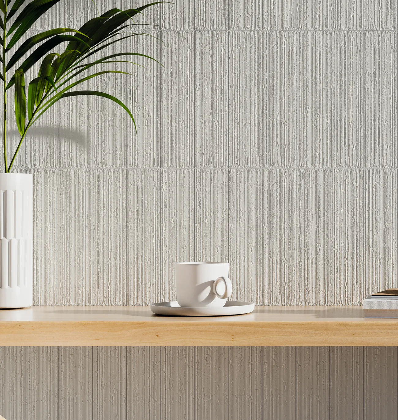
Matt and natural finishes are widely specified because they give stone, concrete and timber-effect colours a more authentic appearance. They also reduce glare and suit busy family spaces. Textured or structured porcelain can offer improved grip for bathrooms, utility areas and commercial entrances, although its surface profile may require more attention during cleaning.
Always select the finish according to the actual installation area, not simply the visual sample. A floor that looks right but does not meet the required slip-resistance, wear or maintenance expectations creates avoidable project risk.
Size, grout and layout change how colour reads
Large-format porcelain often makes a floor feel calmer because there are fewer grout joints breaking up the surface. This can be especially effective with light stone-effect porcelain in open-plan rooms. It does, however, require a suitably flat substrate, appropriate adhesive coverage and experienced installation to achieve a professional finish.
Smaller formats introduce more grout lines and visual rhythm. They are useful in compact bathrooms, period properties and spaces where a traditional or decorative character is wanted. A square 200 x 200 mm tile, for example, can make a colour feel more expressive than the same shade in a 600 x 600 mm format.
Grout can either blend into the floor or create deliberate definition. Matching grout creates a continuous, quieter result, while contrast grout highlights the tile shape and laying pattern. With wood-effect porcelain planks, close tonal matching is usually the better route. With patterned or terrazzo-effect tiles, a neutral grout that picks up a background shade keeps the design controlled.
Practical colour choices by room
For kitchens, warm stone, greige concrete and pale terrazzo effects offer a balance of design flexibility and everyday practicality. Consider cabinet colours and worktop samples together with the tile, rather than choosing each finish in isolation.
Bathrooms can support lighter porcelain colours, as they help smaller rooms feel less enclosed. Soft grey, warm white and pale stone work well with both chrome and brass fittings. If using a darker floor, balance it with lighter walls, good task lighting and sufficient contrast around thresholds.
Hallways need resilience as well as style. Mid-tone stone, slate and patterned porcelain are sensible options because they manage the visual demands of wet shoes, grit and regular footfall. For commercial projects, the selection should also account for entrance matting, cleaning routines, slip resistance and the expected traffic level.
Order samples before finalising the scheme
Screen images and showroom displays are valuable starting points, but they cannot fully show how a porcelain tile colour will behave in your property. Order a sample and place it beside cabinetry, paint swatches, fabrics and timber finishes. View it in morning light, evening light and under the artificial lighting used in the room.
Where possible, lay several samples next to each other. This reveals shade variation, repeat pattern and the scale of veining or aggregate. For larger projects, confirm batch consistency and calculate quantities with a sensible allowance for cuts, layout and future repairs. The correct adhesive, grout, trims and preparation materials should be planned at the same stage, particularly with large-format porcelain or heated floors.
A well-chosen porcelain floor does not need to compete with every finish around it. Give the colour time in the space, check its practical credentials, and let the final specification support the way the room will actually be used.