Oak Flooring Colours for Every Room and Style
The right oak flooring colour does more than complete a room. It changes how large the space feels, how daylight is reflected and how easily the floor lives with cabinetry, paint, furnishings and everyday use. With oak flooring colours ranging from pale Scandinavian-inspired boards to smoked browns and near-black finishes, the best choice is usually the one that works with the fixed elements of your project rather than simply following a trend.
For a home renovation, start with the finishes that are hardest or most expensive to change: kitchen units, worktops, doors, brickwork and window frames. For commercial interiors, consider footfall, cleaning routines, lighting and the character the space needs to project. A carefully selected oak floor should feel considered on installation day and remain convincing when the room evolves around it.
How to Choose Oak Flooring Colours
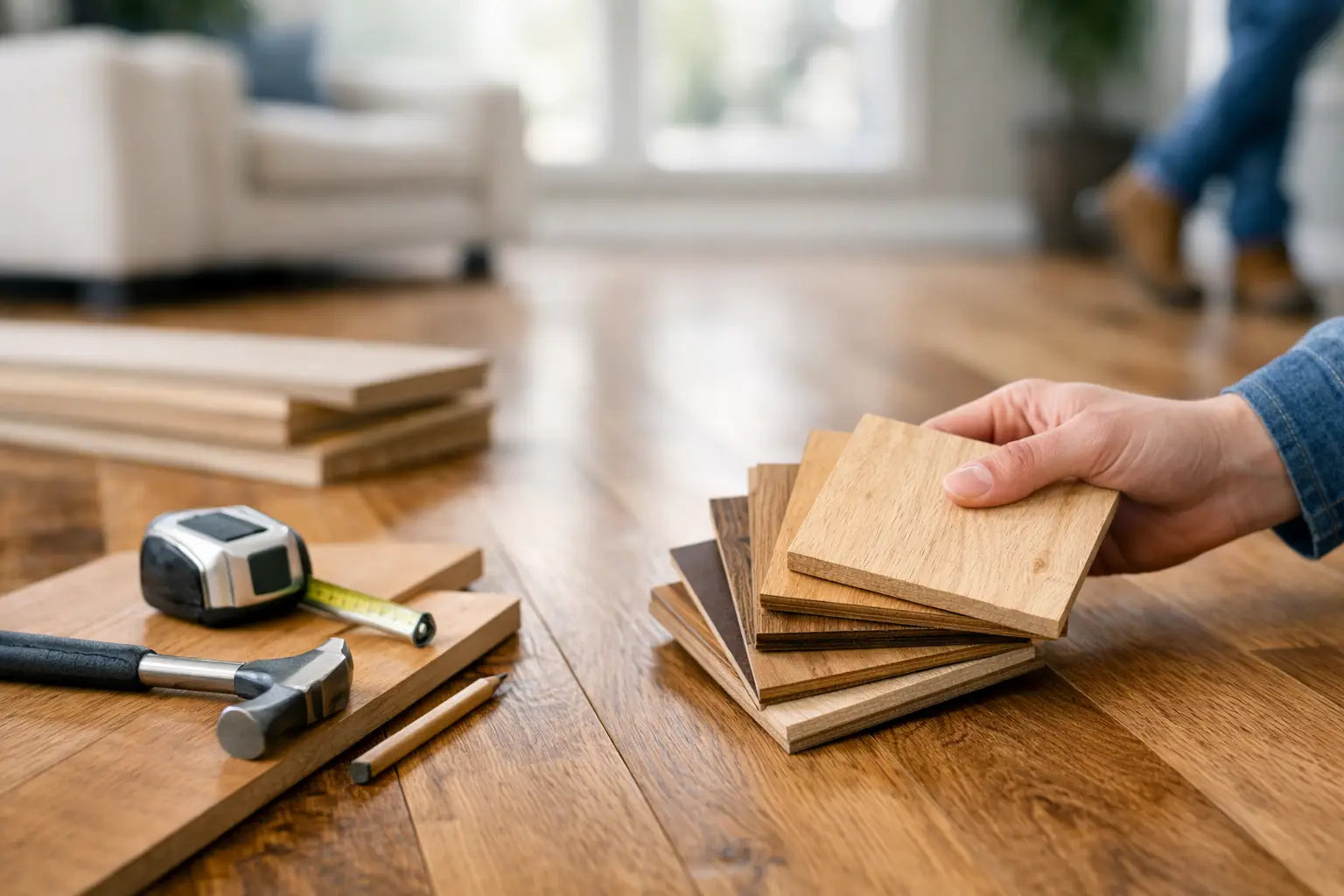
Colour should be assessed in the room where it will be fitted, not only under showroom or screen lighting. Natural oak has grain variation, knots and tonal movement, so a sample provides a far more realistic basis for decision-making than a single product image. Place samples flat on the floor, view them beside your intended paint and joinery, and return to them at different times of day.
The direction and amount of natural light matters. North-facing rooms tend to show cooler light, which can make grey or very pale boards appear flatter and bluer. South-facing spaces receive warmer light and can amplify golden, honey and red undertones. Artificial lighting also has an effect: warm lamps soften smoked and brown oak, while cooler LED lighting can make pale or grey-toned floors appear more contemporary.
Board size deserves the same attention as colour. Wide planks show more of the oak’s natural character and often make an open-plan room feel calmer, especially with a consistent mid-tone finish. Narrower boards introduce more joints and visual rhythm, which can suit period properties and smaller rooms. A dark wide board can look particularly refined, but it needs enough daylight and wall contrast to avoid making the room feel enclosed.
Start with the Undertone
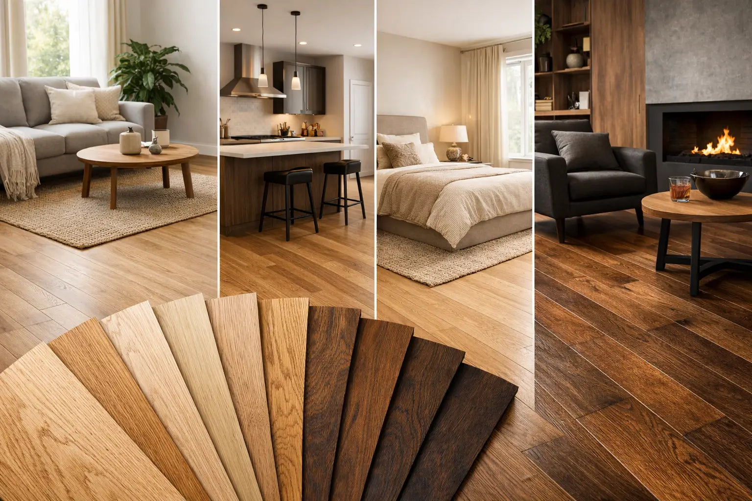
Most oak finishes sit within one of four undertone families: warm golden, neutral natural, cool grey or deep brown. This is more useful than choosing by labels such as light or dark alone.
Warm oak works well with cream, clay, terracotta, aged brass and traditional timber furniture. It can bring welcome softness to a kitchen with stone worktops or a hallway with heritage detailing. However, warm boards can clash with strongly pink or orange finishes, so compare samples directly rather than relying on an assumed match.
Natural and neutral oak is one of the most flexible choices. It retains the recognisable character of the timber without pushing too yellow, grey or brown. This makes it particularly effective for homes where furniture may change over time, as well as for flats, hospitality settings and commercial schemes requiring a broad design appeal.
Grey oak has a clean, architectural quality and can sit comfortably with black metalwork, concrete-effect porcelain and cooler white finishes. The trade-off is that a heavily grey floor may date more quickly than natural oak and can look cold in poorly lit rooms. A lightly brushed, warm-grey oak is often the more adaptable option.
Brown and smoked oak create depth and visual weight. They suit larger living rooms, dining spaces, boutique retail environments and interiors with confident joinery or rich wall colours. Their darker tone can make pale walls and light upholstery stand out, although dust, pet hair and surface scratches are generally more visible than on a mid-tone floor.
Popular Oak Flooring Colours and Where They Work
Pale and whitewashed oak
Pale oak, limed oak and whitewashed finishes are popular for their light-reflecting appearance. They work particularly well in contemporary extensions, coastal-inspired interiors and compact rooms where a brighter, more open feel is wanted. A brushed finish helps retain texture, preventing the floor from appearing too uniform.
Choose pale oak carefully where there are muddy shoes, children or busy entrances. A matt, textured board is usually more forgiving than a smooth lacquered surface, but dirt will still show more readily than it does on a natural mid-oak. In hallways, a durable entrance mat and sensible cleaning routine make a noticeable difference.
Natural and honey oak
Natural oak provides a balanced base for both modern and traditional schemes. It sits easily with white, soft green, blue-grey and warm neutral walls, and it is often the safest choice when selecting flooring before all furniture has been finalised. Honey oak carries more golden warmth, making it a strong option for cottages, period houses and rooms that need a little visual comfort.
Where a kitchen includes oak cabinetry, avoid trying to match the floor exactly. A close-but-not-identical timber tone can look accidental. Instead, create a clear distinction through undertone, plank grade or depth of colour. For example, natural oak flooring can work well beneath slightly darker, more characterful oak joinery.
Smoked and medium brown oak
Smoked oak is valued for its richer, more varied appearance. The smoking process deepens the timber and can bring out darker grain pattern, delivering a finish with substance without the starkness of black or espresso-coloured floors. It pairs well with walnut, charcoal, deep green, navy and aged metal finishes.
Medium brown oak is also practical. It has enough depth to disguise everyday marks better than a very pale board, while retaining more reflected light than a dark floor. For family living areas and busy commercial settings, this middle ground often offers the best balance of appearance and maintenance.
Dark oak and blackened finishes
Dark oak can make a large room feel deliberate and luxurious, particularly alongside high ceilings, generous glazing and lighter walls. It is effective in formal dining rooms, premium retail settings and schemes where the floor is intended to provide contrast.
It is less forgiving in compact, low-light rooms. Dark boards absorb light and show dust, lint and fine surface wear more readily. If the look is right for the project, consider a dark brown or smoked finish with visible grain rather than a flat, uniform black. The texture adds interest and makes daily use less apparent.
Finish, Texture and Grade Affect the Final Colour
Two oak floors described as natural can look entirely different once finish and surface texture are considered. A matt oiled board tends to show the depth of the timber and has a tactile, low-sheen appearance. Lacquered finishes can offer useful protection and straightforward maintenance, but a higher sheen may reflect more light and make scratches easier to notice.
Brushed oak removes softer grain from the surface, leaving subtle texture that enhances the character of the board. It works especially well with pale, natural and smoked tones. Hand-scraped or distressed boards create a more rustic finish, suited to properties where visible variation is part of the intended look rather than something to minimise.
The timber grade also influences colour consistency. Prime or select grade boards generally have fewer knots and a cleaner appearance. Rustic and character grades include more knots, sap and tonal variation, giving the floor a more expressive feel. For large areas, this variation should be expected and embraced rather than judged from one board in isolation.
Coordinate Flooring with Tiles and Other Surfaces
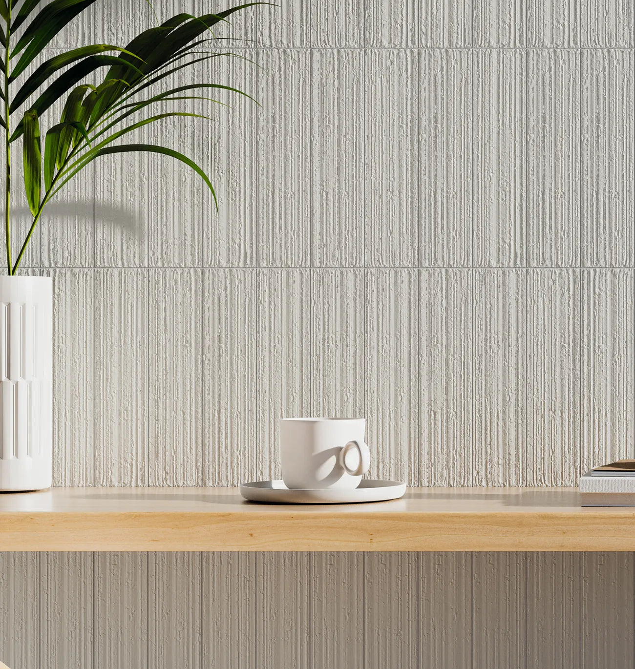
Oak flooring frequently meets porcelain tile in kitchens, utility rooms, bathrooms and entrance areas. The transition should feel intentional. A warm natural oak can be paired with stone-effect porcelain in beige, taupe or soft grey, while pale oak sits well beside restrained concrete-effect tiles. Smoked oak provides a strong contrast against light marble-effect porcelain and can complement darker slate-look designs.
Avoid choosing every surface in the same shade. Matching grey tile, grey oak and grey walls can make a scheme feel flat unless texture and lighting add enough contrast. Combining a timber floor with a tile that has a related undertone, rather than an identical colour, usually gives a more polished result.
Practical detailing matters too. Plan movement joints, suitable thresholds and the finished floor heights before installation begins. In wet areas, use an appropriate tile finish and installation system rather than extending timber flooring into spaces where standing water is likely. This protects the scheme as well as the material.
Order Samples Before Final Specification
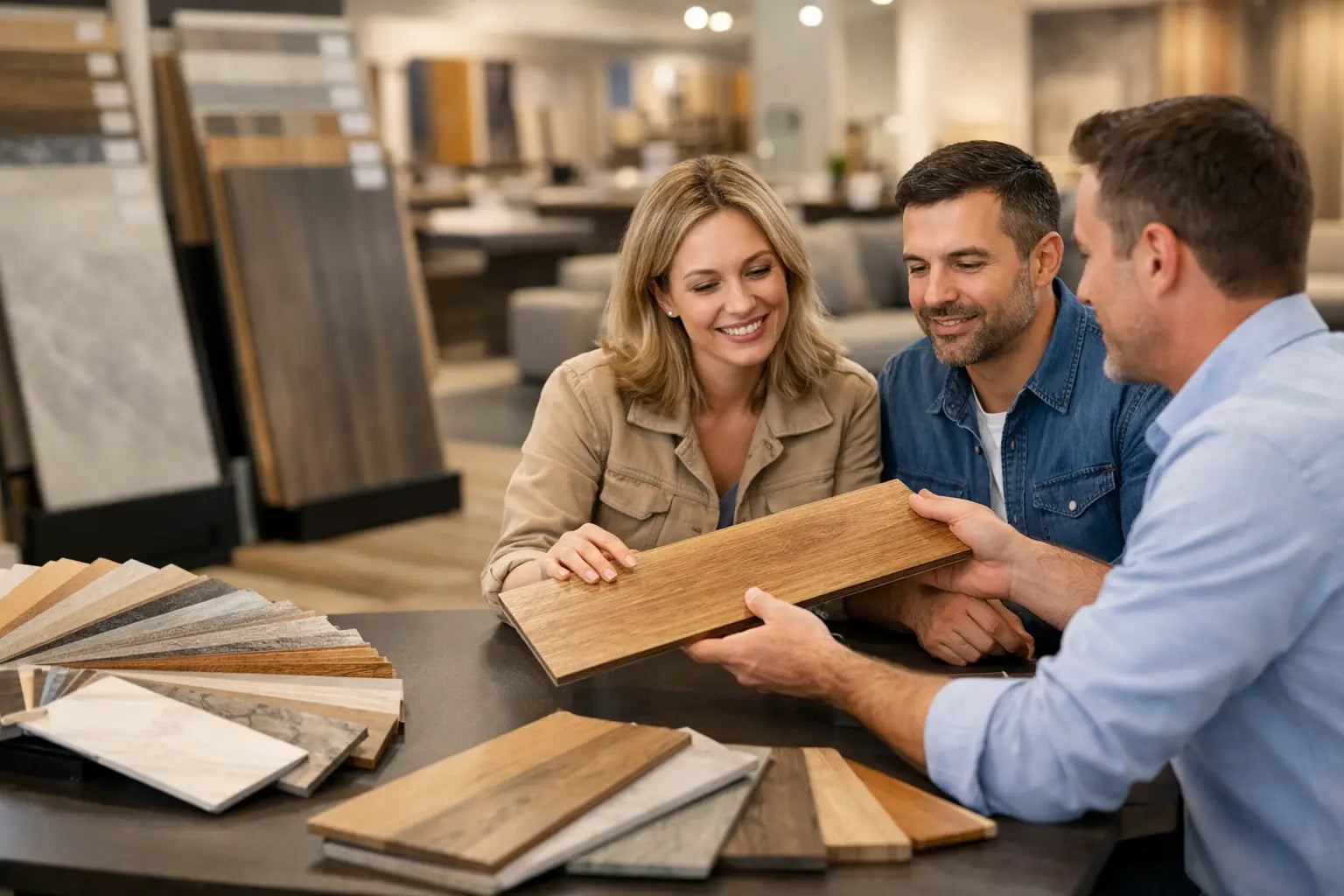
A sample is the simplest way to reduce colour risk. View more than one board where possible, especially with character-grade, brushed or smoked oak, because natural variation is part of the product. Check the sample against cabinetry, tiles and wall colours, then assess it under your usual evening lighting as well as daylight.
For larger projects, confirm the selected colour, format, quantity and lead time before work is programmed. Allow for cutting waste, room shape and plank layout, and ensure suitable underlay, adhesive or fitting accessories are specified for the chosen floor construction. Smart Tiles can help bring flooring, surface finishes and installation materials into one considered project plan.
A floor is one of the largest visual surfaces in any interior, so give its colour the same attention as the kitchen or bathroom finish. Choose an oak tone that supports the light, materials and daily demands of the room, and it will continue to make the whole space feel right long after the decorating is complete.