How to Match Grout Colour for a Polished Finish
A warm white porcelain tile can look calm and expensive beside the right grout, then suddenly read cold or overly busy beside the wrong one. Knowing how to match grout colour is therefore not a small finishing detail - it is a design decision that can change the apparent size, tone and overall quality of a tiled surface.
Grout occupies every joint, so even a narrow line becomes a visible part of the finished scheme. The best choice depends on more than whether the tile is grey, beige or white. Tile undertones, joint width, room lighting, surface texture and the practical demands of the space all matter. A considered selection creates a surface that feels intentional, whether the aim is a quiet, continuous backdrop or a graphic tiled feature.
How to Match Grout Colour: Start With the Tile
Begin by deciding what role the grout should play. In most projects, grout either blends with the tile to create a more unified surface, or contrasts with it to make the layout and shape of each tile more prominent. Neither approach is automatically better. The right direction comes from the tile design and the character you want the room to have.
A close tonal match is particularly effective with large-format porcelain, stone-effect tiles and calm contemporary schemes. Matching grout reduces the appearance of joints, allowing veining, texture and variation in the tile to take the lead. It can also make a compact bathroom, kitchen or hallway feel less broken up. For a soft ivory tile, consider an off-white, light beige or warm pale grey rather than reaching immediately for a stark brilliant white.
A contrasting grout gives the installation more definition. Dark charcoal grout with a pale metro tile, for example, brings out the classic brick pattern and works well in kitchens, utility rooms and character-led bathrooms. This approach is often successful with simple plain tiles, where the geometry of the pattern is part of the design. With heavily patterned encaustic-style tiles or expressive marble-effect porcelain, however, contrast can make the surface feel unnecessarily crowded.
Do not assume a grout needs to match the dominant background colour exactly. A grout that picks out a secondary vein, fleck or warmer note within the tile can look more natural and considered. The aim is tonal harmony, not an exact paint-chart match.
Read the undertone, not just the colour name
Colour names are useful guides, but they are not a substitute for viewing products together. Two grouts labelled ‘grey’ may look entirely different: one may have a blue cast, while another is warm and taupe-based. The same applies to whites, creams and beiges. Put a cool grey grout beside a warm limestone-look tile and the tile can appear yellow; place a creamy grout next to crisp white ceramic and the ceramic may look blue-white by comparison.
Look at the tile sample in natural daylight first, then under the lighting planned for the finished room. North-facing rooms often make colours appear cooler, while warm LED lighting can bring out yellow, beige or red undertones. In commercial settings, reception areas, washrooms and hospitality spaces may use several lighting types across one floor, making sample checks especially worthwhile.
Let Tile Size and Joint Width Guide the Choice
The wider the joint, the more visual influence the grout has. This is why a strong contrast may suit a small-format wall tile but feel dominant with larger tiles laid with a wide joint. Conversely, a close matching grout can help a 600 x 600 mm porcelain floor read as a broad, elegant plane rather than a grid of individual squares.
Tile layout matters too. Brick bond, herringbone and basketweave patterns naturally place more emphasis on joints than a straightforward stacked or straight lay. If you have selected a patterned layout, choose grout with the awareness that it will reinforce that pattern. A similar-toned grout keeps the effect refined; contrast gives it a more decorative, architectural finish.
Rectified porcelain tiles can usually be installed with a narrower joint than non-rectified products, subject to the manufacturer’s recommendation and the condition of the substrate. Narrow joints make grout less conspicuous, but they do not remove the need for a suitable colour choice. On natural stone and handmade-look ceramics, slight size and edge variation often call for wider joints, so grout becomes an even more visible part of the composition.
For floor-to-wall schemes using the same tile, a matching grout colour often creates welcome continuity. Where wall and floor tiles differ, it is usually better to choose a grout that supports each area rather than forcing one exact shade throughout. A warm light grey may bridge a pale stone-effect floor and a soft white wall tile successfully, provided the undertones work together.
Consider the Room’s Use Before Choosing White or Dark Grout
The most striking grout is not always the most practical choice. Brilliant white grout can look fresh around a glazed bathroom wall tile, but it needs regular cleaning and may discolour more noticeably in a busy family kitchen, shower enclosure or entrance area. This does not mean white should be avoided; it simply needs to be chosen with realistic expectations around maintenance and suitable cleaning products.
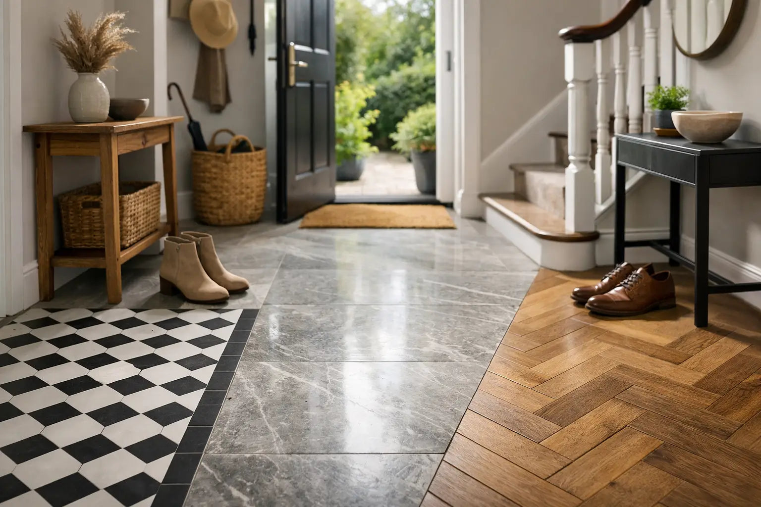
At the other end of the scale, very dark grout can be forgiving with everyday marks on a floor, particularly in hallways, boot rooms and commercial circulation areas. Yet dark grout can show limescale, soap residue and pale dust, especially on shower walls or in hard-water areas. Mid-tone grey, taupe and stone shades are often practical middle ground, working well with a broad range of tiles while masking minor day-to-day variation more effectively than extremes.
For wet areas, specify a grout suitable for the installation and follow the product guidance on joint width, tile type and movement. In shower areas and around baths, remember that grout is not a substitute for flexible sanitary sealant at changes of plane. Internal corners, wall-to-floor junctions and interfaces with sanitaryware need the appropriate flexible finish in a coordinated colour where required.
Test Grout Samples in the Actual Space
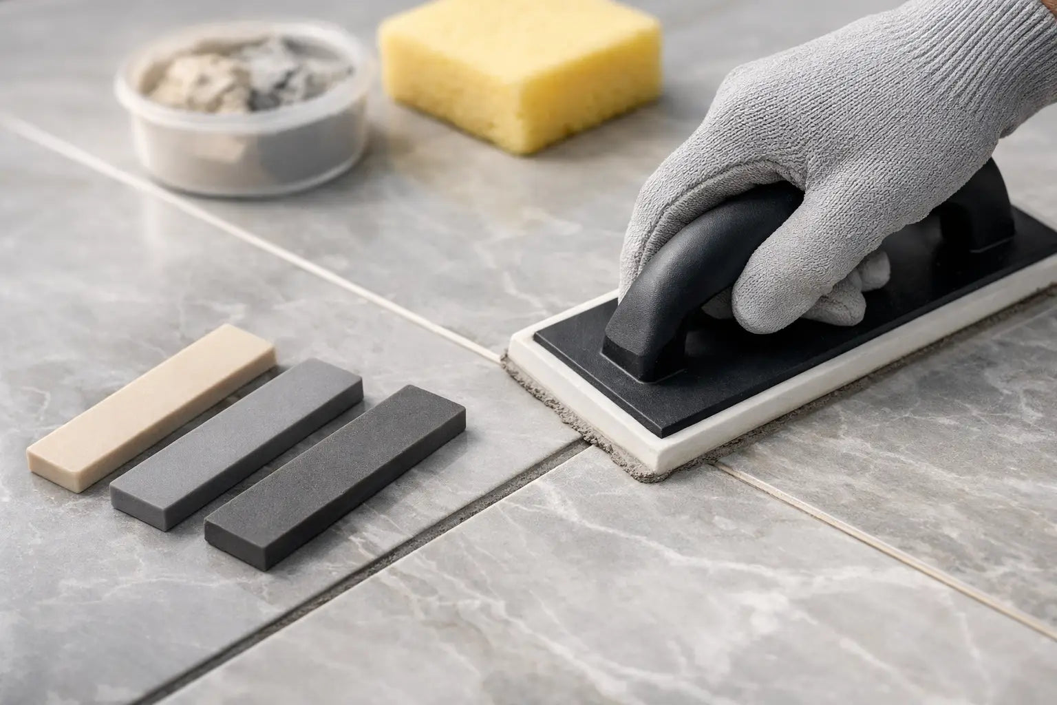
A sample board is one of the most reliable ways to make the final choice. Place the tile samples side by side with grout colour swatches, or ideally make small test boards using the intended tiles and a few shortlisted grout shades. Leave a realistic joint between tiles. Looking at a grout card against the face of one tile is useful, but it cannot fully show the effect of repeated joints across an area.
View the board at different times of day and from standing height, not only close up. In a showroom or under a worktop light, a grout may appear perfect; in the finished room, it may look darker, warmer or more pronounced. This is particularly relevant with polished tiles, metallic details, coloured cabinetry and timber flooring, all of which can influence how a neutral grout is perceived.
Allow for the fact that grout commonly dries lighter than it appears when freshly mixed. The final shade can also be affected by mixing consistency, water quantity, cleaning technique and curing conditions. An installer should follow the manufacturer’s instructions carefully and use the same mixing method throughout the project. This helps avoid shade variation across larger areas.
Coordinate Grout With Trims, Sealants and Adjacent Finishes
Grout should sit comfortably within the wider specification. Look at the tile alongside metal trims, brassware, taps, painted joinery, worktops and flooring transitions. A warm grey grout may be ideal beside brushed brass and oak, while a cleaner pale grey can suit chrome, concrete-effect porcelain and cooler contemporary finishes.
Do not try to make every product identical in colour. Grout, silicone and trims are made from different materials and reflect light differently. The more useful objective is a coordinated family of tones. Where a colour-matched silicone is available, it gives corners and perimeter details a more resolved appearance, particularly in bathrooms and kitchen splashbacks.
For a high-end residential project or a commercial specification, record the selected grout name and colour code alongside the tile reference. This makes ordering, phased installation and future repairs more straightforward. It also reduces the risk of a substitute shade being used when several trades are working on site.
Make the Final Choice With the Whole Surface in Mind
If you are still choosing between two close shades, step back from the individual tile and consider the room as a whole. Select the lighter option when the priority is an airy, continuous feel. Choose the darker or more contrasting option when the tile shape, layout or period character deserves definition. In practical spaces, a balanced mid-tone can offer the best combination of style and easier upkeep.
Smart Tiles can help bring tile samples, grout options and installation materials together before work begins, helping homeowners, designers and trade customers specify with greater confidence. A few minutes spent comparing real samples in the intended light is usually enough to turn an uncertain grout decision into a finish that looks right for years.