European Tile Design Trends for UK Homes
A tile can make a compact cloakroom feel considered, give a family kitchen more presence, or set the tone for an entire hotel entrance. The strongest European tile design trends are not simply about introducing a new colour or pattern. They combine visual character with the practical benefits that matter on real projects: durability, easy maintenance, slip resistance and a finish that will still look right once the room is lived in.
For homeowners, designers and contractors, the current direction from leading Italian and Spanish manufacturers is clear. Surfaces are becoming warmer, more tactile and more expressive, while porcelain technology continues to make premium-looking finishes suitable for hardworking floors and walls.
European tile design trends: warmth, texture and scale
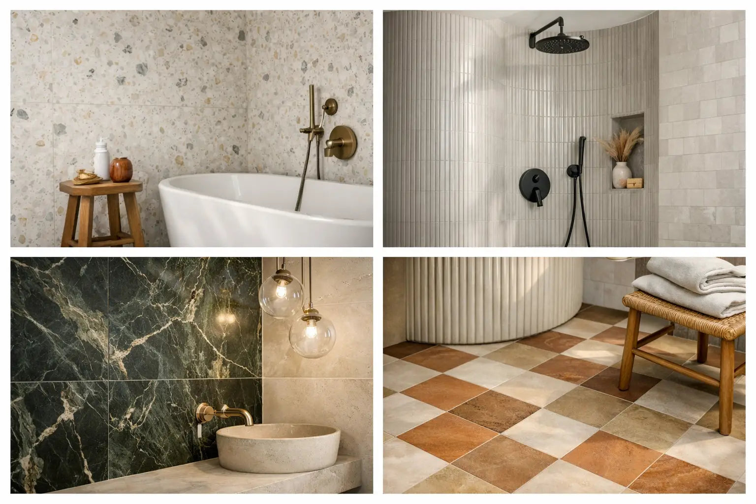
Cool grey schemes have not disappeared, but they are no longer the default starting point. European collections are moving towards sun-baked neutrals, soft chalky whites, clay, tobacco, mushroom, olive and muted blue-green. These colours bring a calmer, more natural quality to bathrooms, kitchens and living spaces without making them feel overly rustic.
The appeal lies in their flexibility. A warm beige stone-effect porcelain can work with oak flooring, brushed brass and painted joinery in a period renovation, yet it can look equally at home alongside contemporary black fittings and clean-lined cabinetry. Choosing an undertone is key. Some beiges lean yellow, others pink or grey, so viewing samples against the room’s existing finishes and under its natural light is essential.
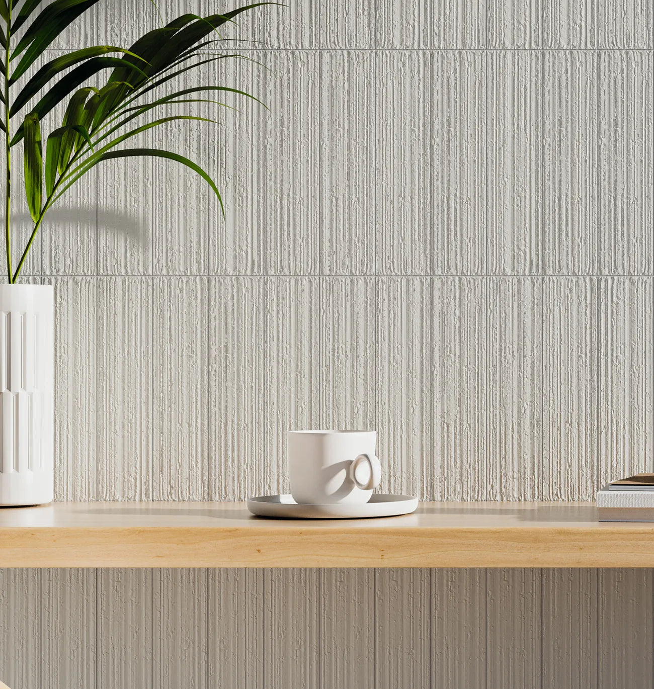
Texture is also becoming more refined. Instead of high-contrast imitation, many European tile designs use gentle mineral variation, fine pitting, soft veining or a hand-worked appearance. These details add depth at close range without overwhelming the wider room. They are particularly effective in large open-plan areas, where a completely flat-looking floor can feel visually cold.
Large formats with fewer interruptions
Large-format porcelain remains a leading choice for contemporary interiors. Sizes such as 600 x 1200mm, 750 x 750mm and 1200 x 1200mm reduce the number of grout joints, creating a more continuous surface across floors and walls. In a shower room, this can make a modest footprint feel more generous. In a kitchen-diner, it gives the floor a calm, architectural quality.
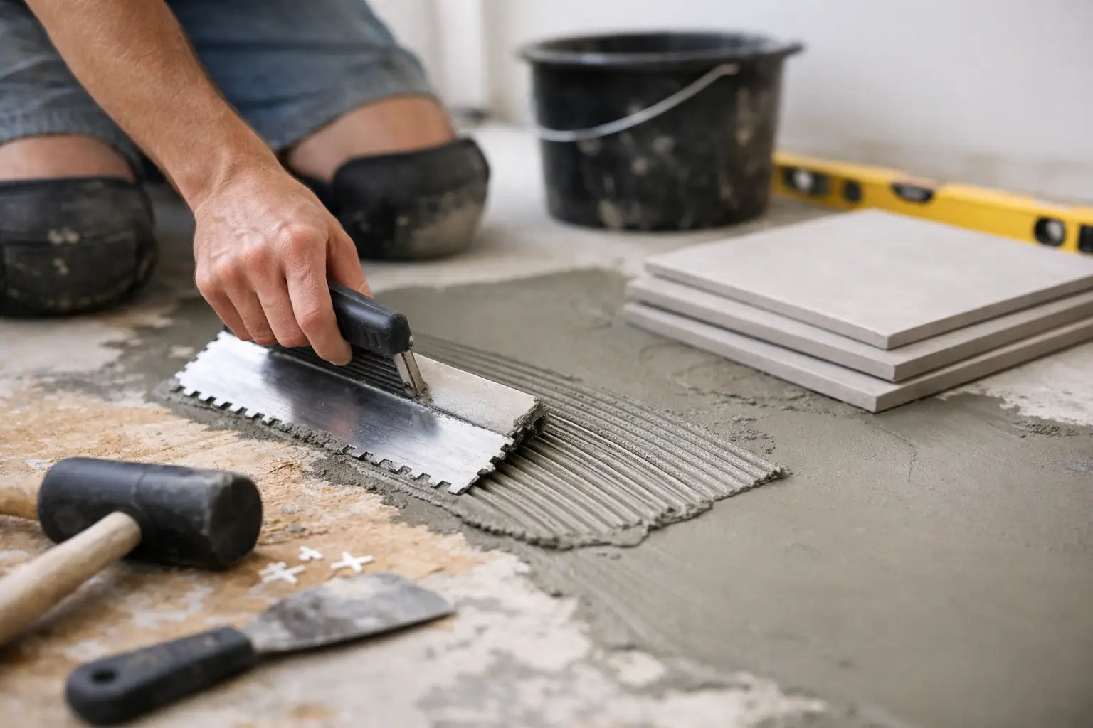
Larger tiles do demand careful planning. Floors and walls must be sufficiently flat, and installation generally requires the correct adhesive, substrate preparation and a skilled installer familiar with handling oversized porcelain. They can also create more cutting waste in awkwardly shaped rooms. A coverage calculation should allow for the tile layout, cuts, pattern matching and a sensible spare quantity for future repairs.
That does not mean smaller formats are out of fashion. In fact, the contrast between a large-format floor and a smaller wall tile is one of the most effective current approaches. A warm stone-effect floor paired with a glazed 100 x 100mm wall tile, for example, gives a bathroom both scale and detail.
Handmade character, with porcelain practicality
Artisanal-looking tiles are prominent across European design, particularly in kitchens, shower walls and hospitality settings. Zellige-inspired finishes, uneven edges, tonal variation and lightly rippled glazes introduce movement that cannot be achieved with a perfectly uniform surface.
This is a trend where expectations should be set correctly. Shade variation, irregular profiles and visible glaze pooling are often intentional features rather than faults. They create a crafted appearance, but they need sympathetic fitting. A narrow grout joint may not suit a tile with irregular edges, while grout colour will have a major effect on the finished look. A close colour match lets the tile surface lead; a contrasting grout makes the grid more graphic.
For areas subject to frequent splashes or heavy use, check the intended application rather than selecting solely by appearance. Some decorative ceramic tiles are ideal for internal walls but are not designed for floors, external settings or high-impact commercial environments. Porcelain alternatives can provide a similar handmade effect where greater strength or lower water absorption is required.
Gloss, satin and matt finishes
Glossy wall tiles are returning in richer, less clinical forms. Think deep forest green, oxblood, inky blue and warm off-white, often in narrow brick, square or elongated rectangular formats. Their reflective surface works especially well in rooms with limited daylight, adding brightness and variation as light moves across the glaze.
Matt finishes remain the practical choice for many floors, particularly in entrances, kitchens and bathrooms. A quality matt porcelain gives a composed appearance and often offers better day-to-day tolerance of water marks and footprints than a highly polished surface. However, matt does not automatically mean slip resistant. The product’s technical rating should always be checked for wet areas, commercial entrances and external installations.
Satin finishes sit between the two and are increasingly useful where clients want softness without a fully matt appearance. They can complement natural timber, painted cabinetry and brushed metal fittings while keeping the surface easy to maintain.
Stone effects are becoming more geological
Marble-effect tiles remain popular, but the trend has shifted away from uniform white marble with dramatic grey veining. European ranges now draw on a broader palette: warm travertine, pale limestone, Jura stone, burgundy marble, dark breccia and earthy quartzite looks. The result is more layered and individual.
Travertine-effect porcelain is especially influential. Its linear structure and honeyed tones offer a relaxed luxury that suits bathrooms, feature walls, fireplace surrounds and open-plan floors. It can be laid in a traditional staggered pattern, but larger rectangular formats with a carefully planned vein direction often feel more contemporary.
Natural stone itself remains a compelling option when its unique variation is the priority. It requires more consideration than porcelain, including appropriate sealing, cleaning and maintenance. For busy family homes, rental properties or commercial projects, stone-effect porcelain can be the more predictable specification. It delivers the visual language of natural material with consistent performance and less ongoing care.
Decorative pattern used with restraint
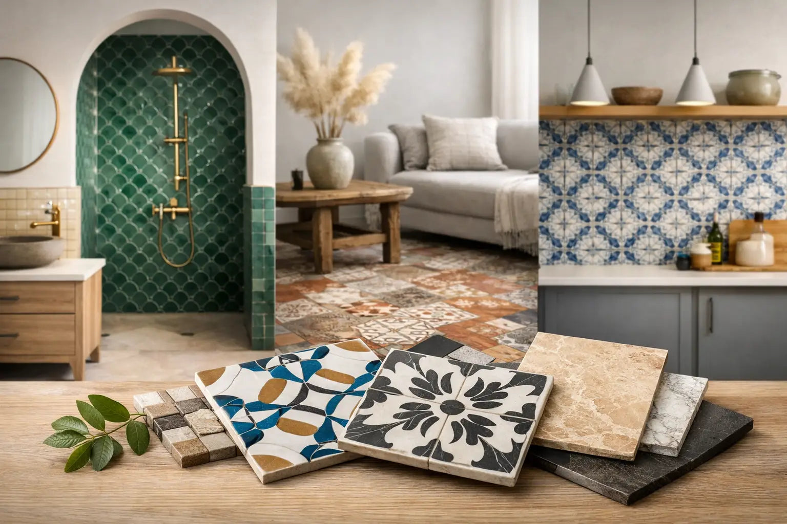
Patterned tiles have matured beyond covering every surface. Current European schemes use decoration to define a zone: a fireplace recess, a kitchen splashback, a shower enclosure, a bar front or the threshold of a hallway. This approach gives the pattern room to be noticed and keeps the overall specification balanced.
Encaustic-inspired porcelain, geometric motifs and heritage-style florals are still valuable for period properties and characterful renovations. The most successful schemes usually take one or two colours from the pattern and repeat them elsewhere through paint, joinery or accessories. That creates a joined-up result without making the space feel themed.
Fluted, finger and kit kat tiles also remain popular, particularly for curved walls, vanity fronts and feature niches. Their vertical lines can make low ceilings appear higher, while their texture brings shadow and movement to a simple palette. Because these formats have more joints, grout selection and regular cleaning should be considered at the specification stage, especially around cooking areas.
Designing for continuity between rooms
One of the most useful European tile design trends is continuity. Rather than treating each room as a separate scheme, homeowners and specifiers are selecting related surfaces that carry through a property. A stone-effect porcelain in the entrance can continue into a utility room and kitchen, while a matching wall finish or tonal decorative tile gives the bathroom a clear connection to the wider home.
This is not a reason to use one tile everywhere. The aim is a coherent material palette. A large-format limestone-effect floor might sit alongside a smaller warm-white wall tile, or an oak-effect floor may be paired with a softly textured ceramic in the bathroom. Repeating undertones, grout colours or metal finishes can be enough to make varied rooms feel intentional.
For commercial interiors, continuity also has practical value. A defined family of tiles simplifies ordering, allows for consistent installation details and makes future replacements easier to manage. It is worth retaining spare tiles from the original batch, particularly for patterned, directional or shade-varied products.
Specify the finish as carefully as the look
A well-chosen tile needs the correct support behind it. Before finalising a selection, consider the substrate, room use, tile size, slip requirement, expected traffic and maintenance routine. Bathrooms may require tanking systems in wet zones; timber floors may need suitable boards or uncoupling systems; large porcelain formats need appropriate adhesive coverage and levelling.
Grout, trims and movement joints should support the design rather than be left as late decisions. A colour-matched grout can make a stone-effect floor feel continuous, while a slim metal trim can provide a clean transition at external corners. In commercial projects, these details are equally important for durability and a professional finish.
Samples remain the most reliable way to compare colour, scale and texture before placing an order. At Smart Tiles, viewing a tile in the showroom or in the intended room helps turn a promising image into a confident specification. Choose the surface that suits the building, the daily use and the installation plan, and the finished space will feel current long after a passing trend has moved on.