Rectified Versus Pressed Tiles: Which Fits Best?
A narrow grout joint can make a large-format porcelain floor feel calm, continuous and distinctly architectural. That is often where the choice between rectified versus pressed tiles becomes relevant. The difference is not simply visual: it affects layout, grout selection, substrate preparation, fitting time and, ultimately, how polished the finished room appears.
For a bathroom renovation, kitchen floor or commercial reception area, neither option is automatically better. The right tile edge depends on the look you want, the format you are specifying and the practical conditions of the installation.
What is the difference between rectified and pressed tiles?
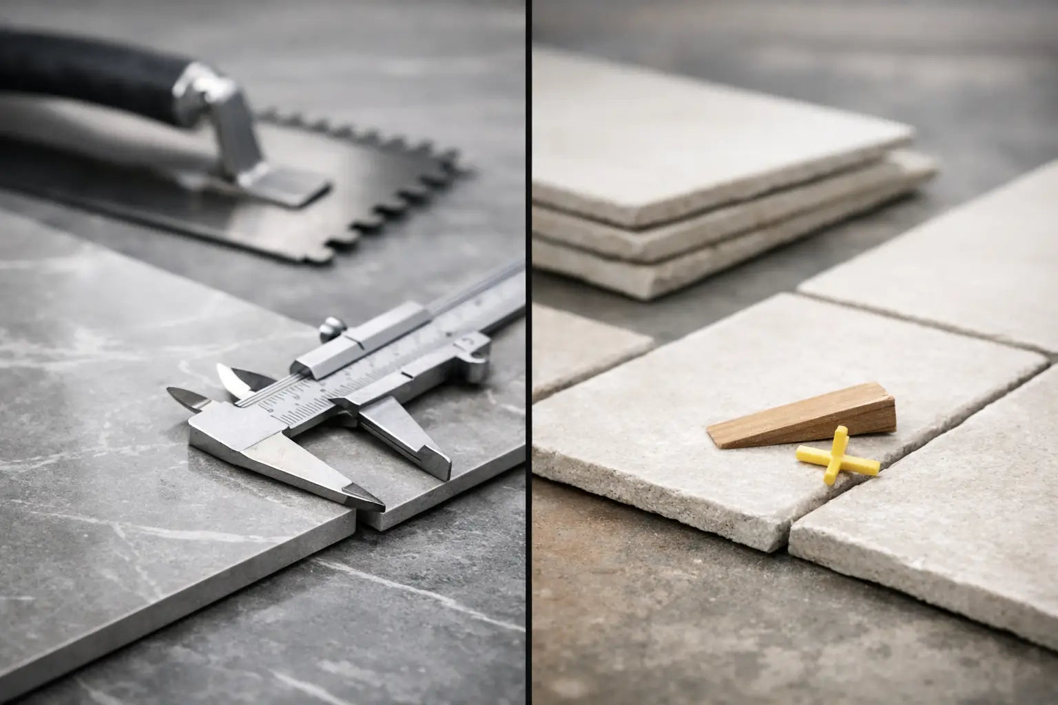
Most ceramic and porcelain tiles begin life in a mould or press before being fired in a kiln. During firing, small dimensional changes can occur. A traditional pressed tile is supplied with its fired edges intact, so its size may vary slightly between tiles and batches within the manufacturer’s stated tolerance.
A rectified tile is fired first, then mechanically cut or ground to a highly consistent size with clean, straight edges. This additional finishing process gives each tile a more precise profile and allows for tighter, more uniform grout joints.
The word “pressed” can therefore be slightly misleading. Rectified tiles are usually pressed too; the practical comparison is generally between rectified tiles and standard, non-rectified pressed tiles.
Rectified tiles for a crisp, contemporary finish
Rectified porcelain tiles are a natural choice where clean geometry is central to the design. They work particularly well with large formats, concrete-effect surfaces, marble-effect porcelain and minimalist schemes where the tile layout should read as an almost uninterrupted plane.
Because the dimensions are closely controlled, rectified tiles can be fitted with narrower grout joints than standard pressed tiles. A 2 mm joint is often specified for indoor rectified porcelain, although the final joint width should always follow the tile manufacturer’s guidance and reflect the installer’s assessment of the site. Grout remains essential: tiles should not be butted edge to edge.
A finer joint does more than reduce visible grout. It can make a small en-suite feel less broken up, allow the veining in marble-effect tiles to flow with greater intent, and give a commercial interior a more considered finish. On walls, it is especially effective in full-height bathrooms, shower areas and kitchen splashbacks where straight lines are easy to appreciate at close range.
However, precise edges demand precise installation. Large rectified tiles will draw attention to an uneven wall or floor, lippage between neighbouring tiles, or inconsistent joints. The substrate must be suitably flat, sound and prepared with the correct boards, levelling materials or adhesive bed. This is not a reason to avoid rectified tiles, but it is a reason to allow for professional preparation in the project budget.
Where rectified tiles work best
Rectified formats are particularly suited to modern bathrooms, open-plan kitchen and dining spaces, entrance halls and hospitality settings. They are also popular where a floor tile continues into an adjacent space, as the consistent edge helps the layout feel ordered across a larger area.
They are available in a broad choice of matt, polished, stone-effect, terrazzo-effect and decorative porcelain finishes. The edge treatment does not determine whether a tile is suitable for floors, walls, wet areas or underfloor heating. Those decisions should be based on the individual product’s technical specification, finish and intended use.
Pressed tiles and the appeal of a softer edge
Standard pressed tiles have a slightly more relaxed character. Their edges may be gently cushioned or varied rather than sharply square, and they are normally laid with a wider grout joint to accommodate normal size variation. This can be an advantage when the desired look is traditional, handmade-inspired or deliberately tactile.
Think of a glazed metro tile with gentle rippling, a rustic terracotta-look porcelain, or a patterned wall tile designed to bring colour and movement to a kitchen. A visible grout joint frames the tile and becomes part of the overall design rather than something to minimise.
Pressed tiles can also be more forgiving on projects where walls are not perfectly true, although sound preparation is still required for every tile installation. The wider joint gives the installer more scope to maintain an even visual line where slight variation exists between pieces. In older properties, where walls and floors may contain more irregularity, this can support a balanced result.
The trade-off is that the finished surface will not have the same near-continuous appearance as a rectified large-format tile. That is not a compromise when the tile has character. Often, it is exactly what makes the scheme feel warmer and more expressive.
Rectified versus pressed tiles: grout joints and layout
Grout is one of the clearest visual differences between these options. With rectified tiles, a colour-matched grout can recede into the surface and enhance the impression of scale. For pale limestone-effect porcelain, soft grey concrete tiles or white marble effects, this can create a refined, low-interruption finish.
With pressed tiles, grout can either blend in or provide contrast. A deep grout around pale metro tiles creates definition and a more graphic look. A closely matched grout around a handmade-look ceramic softens the overall pattern while allowing the glaze and texture to take focus.
Tile size also matters. A rectified 600 x 1200 mm porcelain tile installed with narrow joints will look very different from a small pressed wall tile with a 3 mm or wider joint. Before ordering, consider where full tiles will fall, how cuts will land at doorways and corners, and whether the room has a feature wall, niche or central line that deserves a symmetrical layout.
For projects using patterned or directional tiles, discuss the layout before fitting begins. A strong marble vein, timber-effect plank or decorative repeat can need careful setting out to avoid awkward cuts and preserve the intended visual rhythm.
Installation considerations that affect the result
The cleaner appearance of rectified tiles does not mean they are difficult by default, but they leave less room for error. On floors, a suitable levelling system may help control lippage with larger formats. On walls, appropriate background preparation and a correct adhesive choice are equally important.
Coverage is critical, especially with large porcelain floor tiles and tiles installed in wet areas. The adhesive, trowel size, tile back and substrate condition must be considered by a competent installer to achieve the coverage required for the application. Movement joints and perimeter gaps should also be planned rather than filled rigidly with grout.
Pressed tiles have their own fitting considerations. Handmade-look ceramics may show intentional variation in glaze, shape or surface texture. Tiles should be taken from several boxes during installation to distribute that variation naturally across the wall or floor. Check shade and calibre information before fitting, particularly when matching tiles from different deliveries.
Whichever edge type you choose, order sufficient material at the outset. Allow for cuts, breakages, layout direction and sensible spare tiles for future repairs. Complex rooms, diagonal patterns and large-format installations may require a higher allowance than a straightforward rectangular room.
Cost, maintenance and specification choices
Rectification adds a manufacturing stage, so rectified tiles can carry a higher price than a comparable standard pressed design. The total installed cost may also be higher if extra substrate levelling, specialist handling or more detailed setting out is required. For a premium bathroom or statement ground-floor space, that investment can be justified by the finished appearance.
Pressed tiles can offer excellent value, particularly in smaller formats and decorative collections. They are not a lower-grade choice. Many high-quality European ceramic and porcelain ranges use a pressed edge because it suits the product’s design and intended aesthetic.
In daily use, maintenance is shaped more by the tile finish and grout selection than by whether a tile is rectified. Porcelain is a practical choice for busy kitchens, hallways and bathrooms because it is durable and low maintenance. Textured or matt surfaces may offer useful slip resistance, but can need more considered cleaning than a smooth wall tile. Select grout that is appropriate for the room and joint width, and consider stain resistance and colour retention in high-use spaces.
How to choose with confidence
Choose rectified tiles when you want tight joints, clean lines and a contemporary surface with minimal visual interruption. They are particularly effective in larger formats and design-led schemes where precision is part of the appeal.
Choose pressed tiles when the character of the tile, a more visible grout line or a softer, more traditional finish suits the room. They can be every bit as durable and desirable, while offering an aesthetic that feels less formal.
A sample is the best way to judge the difference. View it in the room, alongside cabinetry, paint colours and worktops, and look at the edge as well as the face of the tile. Smart Tiles can help bring together the tile, grout, trims, adhesives and preparation materials so the specification supports the finish you have chosen.
The strongest projects begin with the intended result, not just the tile size or price. Once you can picture whether the room needs crisp continuity or more visible character, the right edge treatment becomes a much simpler decision.