How to Choose Kitchen Splashback Tiles Well
A splashback may cover a relatively small area, but it sits at eye level between the worktop, cabinetry and appliances. It is often the surface that decides whether a kitchen feels considered or unfinished. Knowing how to choose kitchen splashback tiles means balancing the look you want with cleaning, grout lines, cutting details and the realities of your kitchen layout.
The best choice is rarely just the trendiest tile on a display. A richly veined porcelain can create a striking focal point, while a simple glazed ceramic may be the more effective partner for a detailed worktop or statement cabinetry. Start with the whole scheme, then specify a tile that will perform well in the areas where you cook, wash and prepare food.
Start with the surfaces already in the room
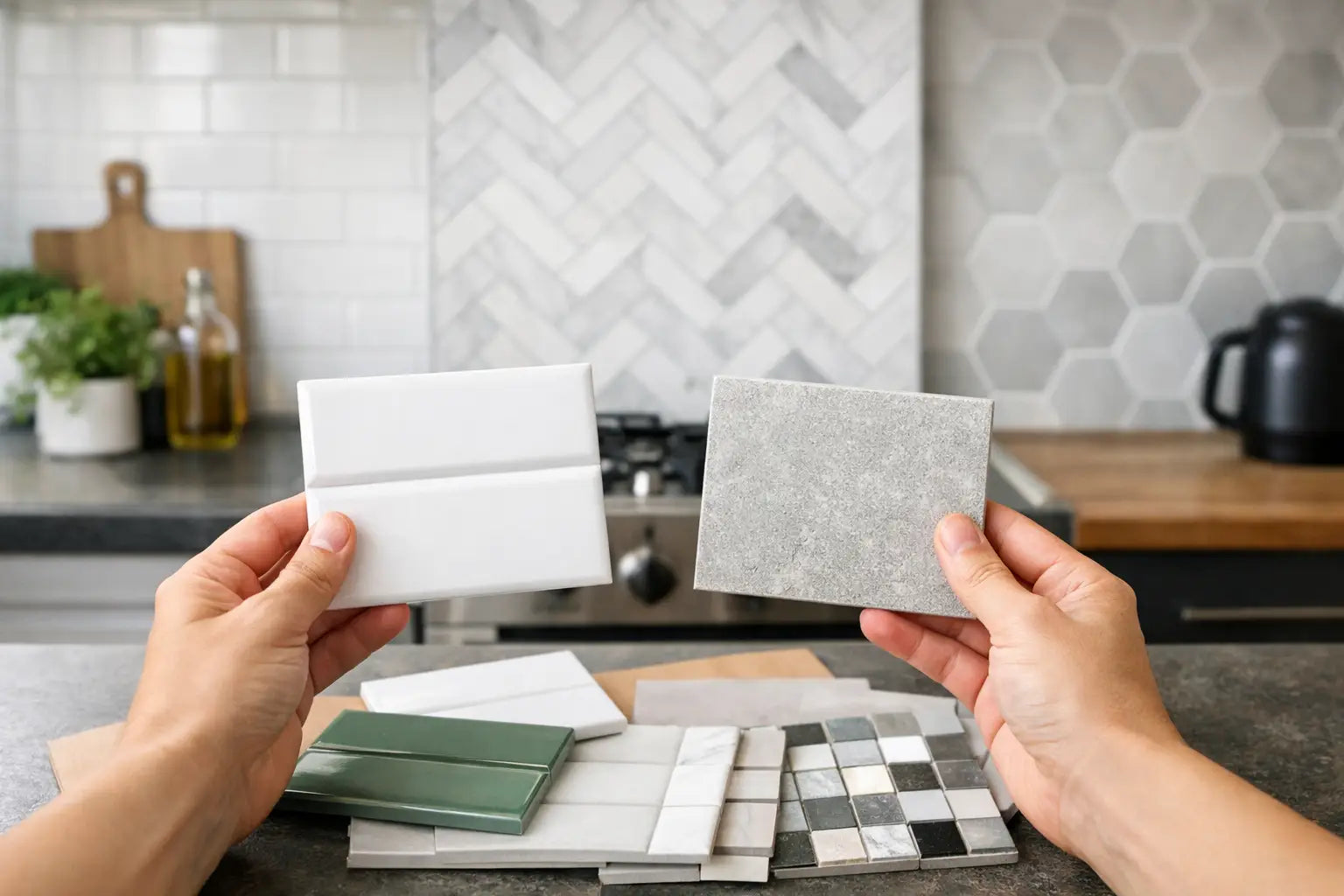
Kitchen tiles should complement the fixed elements that are least likely to change: worktops, cabinets, flooring and paint. Bring samples together in the kitchen wherever possible. Natural and artificial light can shift a tile's tone considerably, particularly with white, cream, grey and green shades.
If the worktop has strong veining, movement or a pronounced pattern, a quieter splashback usually gives the room better balance. A plain matt or softly textured tile can pick up a colour from the worktop without competing with it. Conversely, a simple quartz, timber or solid-colour worktop gives you more freedom to introduce a patterned, handmade-effect or high-gloss wall tile.
Consider the cabinet finish too. Dark painted cabinets can carry a lighter splashback that lifts the room, while pale cabinetry often benefits from contrast or texture to avoid a flat, all-white result. For handleless contemporary kitchens, large-format tiles or porcelain slabs can create a clean architectural backdrop. In more traditional kitchens, metro formats, decorative borders or gently irregular artisan-style tiles may suit the character of the joinery.
Choose the right material for a kitchen splashback
Ceramic and porcelain are both excellent choices for splashbacks, but they offer different visual and practical possibilities.
Glazed ceramic wall tiles are available in a broad range of colours, shapes and finishes. They are especially well suited to feature splashbacks, including gloss metro tiles, zellige-inspired designs and decorative patterns. Their lighter construction makes them a popular choice for walls, and their variation in glaze can bring warmth and personality to a kitchen.
Porcelain is denser and highly durable. It is a strong specification choice where the splashback continues behind a range cooker, across a large open-plan kitchen or into a utility area. Porcelain can reproduce stone, concrete, marble and metal effects convincingly, with the consistency and easy-care qualities that suit busy homes and commercial environments.
Natural stone can look exceptional, particularly in refined, design-led kitchens, but it needs more consideration. Some stones require sealing and ongoing care, and acidic spills can affect certain finishes. If you want the look of marble or limestone with lower maintenance, stone-effect porcelain provides a practical alternative.
How to choose kitchen splashback tiles by format
Tile size and shape affect more than appearance. They determine the number of grout joints, the amount of cutting required and how easily the splashback works around sockets, switches, cooker hoods and window reveals.
Small formats create detail
Metro, square, kit-kat and mosaic tiles bring rhythm and texture to a kitchen wall. They can work particularly well in a compact area behind a hob or sink, where the splashback acts as a deliberate feature. The trade-off is more grout. This means more lines to clean, and greater care is needed to keep spacing consistent around electrical accessories.
A small tile is also less forgiving of uneven walls. Professional preparation, the correct adhesive and suitable spacers make a visible difference to the finished result.
Large formats reduce visual interruption
Large-format porcelain gives a more continuous appearance, with fewer grout joints and less visual clutter. It is an excellent option for contemporary kitchens, especially where you want the splashback to echo a porcelain worktop or floor tile.
However, large tiles need careful handling and accurate cutting. Their size can make fitting around sockets and cupboards more demanding, so check the wall dimensions and proposed tile layout before ordering. In some kitchens, a medium-format tile offers the best compromise between a calm finish and manageable installation.
Plan the layout before you buy
Do not leave layout decisions until the tiles arrive. Decide where full tiles should fall, whether a central joint will align with the hob, and how cut pieces will sit at the ends of the run. A narrow sliver beside a tall unit can undermine an otherwise premium installation.
This is particularly important with patterned or directional tiles. Check whether the design repeats, whether it needs to be installed in a particular orientation and how the pattern will meet at internal corners. Order samples first if there is any uncertainty about scale, sheen or shade variation.
Select a finish that suits daily use
Gloss tiles reflect light and are useful for brightening kitchens with limited daylight. Their glazed surface is generally straightforward to wipe down, although splashes and fingerprints can be more visible in strong side light. A gloss finish can be a good fit for a classic metro layout or a compact kitchen that needs more bounce from its lighting.
Matt tiles have a softer, more contemporary appearance and can disguise marks better than high gloss in some colours. Textured surfaces add depth but should be assessed carefully behind the hob, where cooking residue is more likely to settle into pronounced relief. A gentle texture is usually manageable; a deeply creviced finish may demand more regular cleaning.
For most kitchens, a smooth glazed ceramic or porcelain splashback combines visual appeal with sensible maintenance. If the tile will sit directly behind a gas hob, choose a material and installation system suitable for the expected heat exposure, and follow the appliance manufacturer's clearances.
Grout is part of the design, not an afterthought
Grout can either frame each tile or allow the surface to read as one. A tonal grout close to the tile colour creates a calmer result and is often preferred with large-format tiles, stone effects and understated schemes. A contrasting grout makes the layout more graphic, which can look effective with brick-bond metro tiles and geometric formats.
In working areas, consider how the grout colour will age. Bright white grout can look sharp when new but may need more attention behind a hob or beside a sink. Mid-toned grey, warm beige or a colour-matched grout can be more forgiving while still looking refined.
Use a quality grout suited to wall tiling and the tile joint width. Silicone sealant, rather than grout, should be used at movement joints such as the junction between the worktop and splashback. Selecting a colour-matched sealant and trim gives the installation a more complete finish.
Measure accurately and allow for cuts and wastage
Measure the height and length of each splashback section separately, then deduct only openings that are genuinely significant. Small socket cut-outs still require tiles and create additional cutting, so they should not be treated as saved material.
Add an allowance for cuts, breakages and future repairs. Around 10 per cent is common for a straightforward layout, while patterned tiles, diagonal layouts, numerous sockets or complex returns may require more. Batch and shade details matter too: buying the full quantity together helps maintain consistency, especially with tiles that have intentional tonal variation.
Remember to specify the complete installation system. This can include wall preparation boards where required, adhesive, grout, spacers, levelling components, trims, sealant and suitable cleaning products. The tile is the visible finish, but the preparation and fixing materials support its long-term performance.
Make samples and practical advice part of the decision
A sample lets you judge a tile in your own lighting, alongside your worktop and cabinet door. View it in the morning, under task lighting and in the evening. Check the surface with a damp cloth as well, particularly if you are considering a heavily textured or very dark tile.
For larger projects or high-value kitchen schemes, it is worth confirming the tile dimensions, intended grout width, trim position and fixing requirements before installation begins. Smart Tiles can support this process with design-led tile samples, coverage guidance and the associated installation materials needed to turn a selected finish into a properly specified project.
Choose a splashback that still looks purposeful when the kettle, toaster and everyday cooking are happening around it. The right tile should earn its place through proportion, finish and practical performance, then remain a pleasure to live with long after the renovation is complete.