Article: Grey Porcelain Wall and Floor Tiles Guide
Grey Porcelain Wall and Floor Tiles Guide
Grey can look flat or it can make a room feel composed, architectural and expensive. The difference usually comes down to the tile itself - its undertone, finish, size and how well it suits the space. Grey porcelain wall and floor tiles remain one of the most specified surface choices for UK homes and commercial interiors because they balance visual restraint with serious day-to-day performance.
For homeowners, they offer a clean backdrop that will not date quickly. For designers, contractors and specifiers, they solve practical problems as well as aesthetic ones. Porcelain is durable, low maintenance and suitable for high-use settings, while grey works across modern, classic and industrial schemes without forcing the rest of the palette in one direction.
Why grey porcelain wall and floor tiles work so well
Grey is one of the few colours that can sit quietly in a room while still shaping the overall mood. A pale grey tile can open up a bathroom without the starkness of brilliant white. Mid grey creates depth and contrast, especially when paired with timber, brushed brass or matt black details. Dark charcoal greys bring weight and drama, but they need more natural light and enough visual space to avoid making a room feel enclosed.
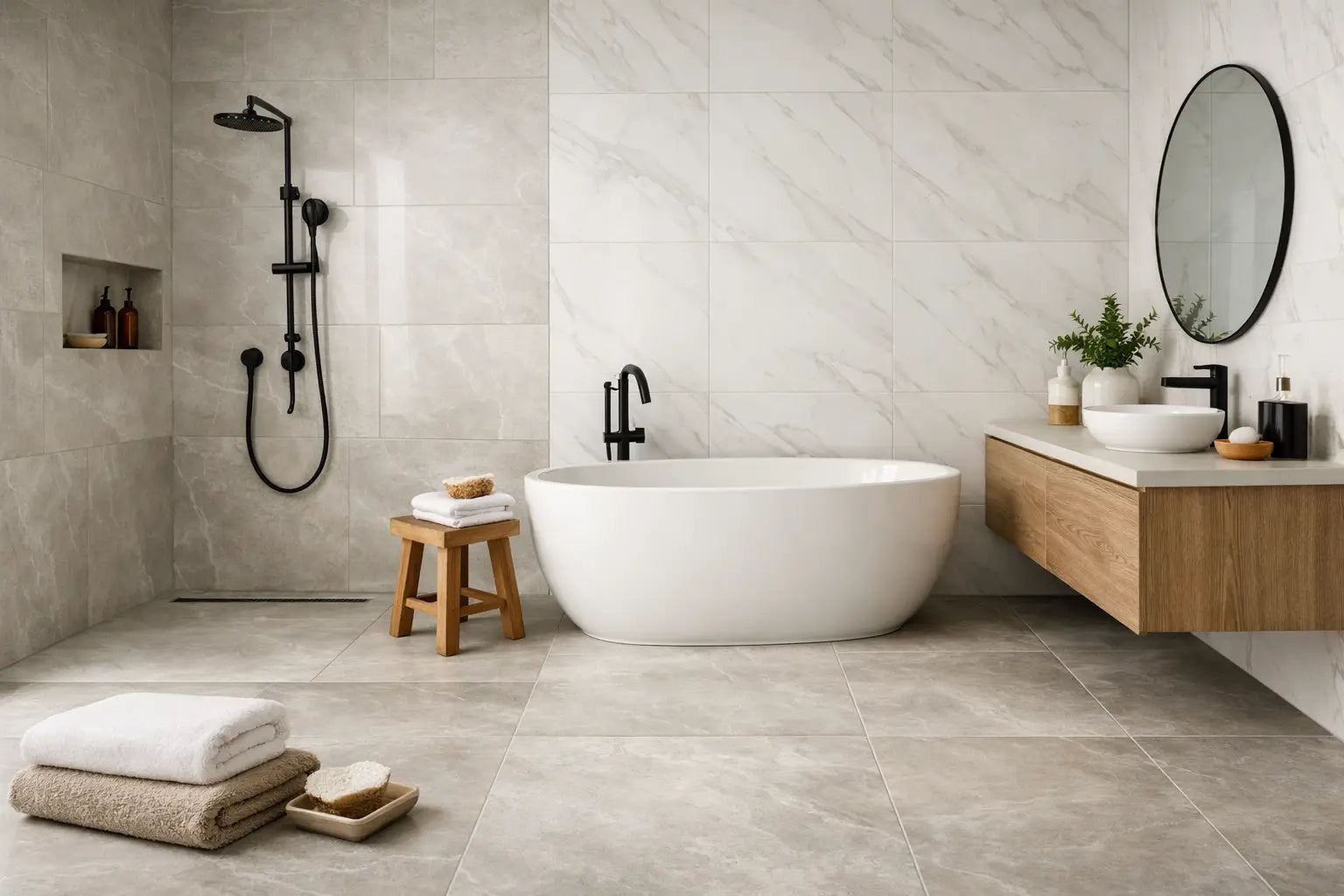
Porcelain adds another layer of appeal. It is denser than standard ceramic, making it a strong choice for floors and a reliable option in wet areas such as bathrooms, utility rooms and cloakrooms. It also works well where continuity matters. Using the same porcelain tile across both walls and floors can make a compact room feel more considered and less visually broken up.
That said, the best result is not always about using one tile everywhere. In some schemes, a simpler floor tile paired with a more tactile or decorative wall finish creates a better balance. It depends on the size of the room, the amount of light, and whether the project calls for a calm backdrop or a more design-led statement.
Choosing the right shade of grey
Not all grey tiles read the same once installed. Some lean warm with taupe or beige notes, while others have cooler blue or concrete undertones. Under showroom lighting or on a screen, these differences can seem minor. In a bathroom with limited daylight or a hallway lit mainly in the evening, they become much more obvious.
Warm greys are often the safer choice for residential interiors where you want softness and flexibility. They sit comfortably with natural wood, cream paint, brassware and warmer white sanitaryware. Cooler greys can look crisp and contemporary, particularly in kitchens or commercial settings, but they need careful coordination if you want the room to feel welcoming rather than severe.
This is where samples matter. A grey tile should be viewed in the actual room, against cabinetry, paint, worktops or sanitaryware, and at different times of day. A tile that looks perfect in isolation can feel too cold, too dark or too busy once placed in context.
Light, mid and dark greys
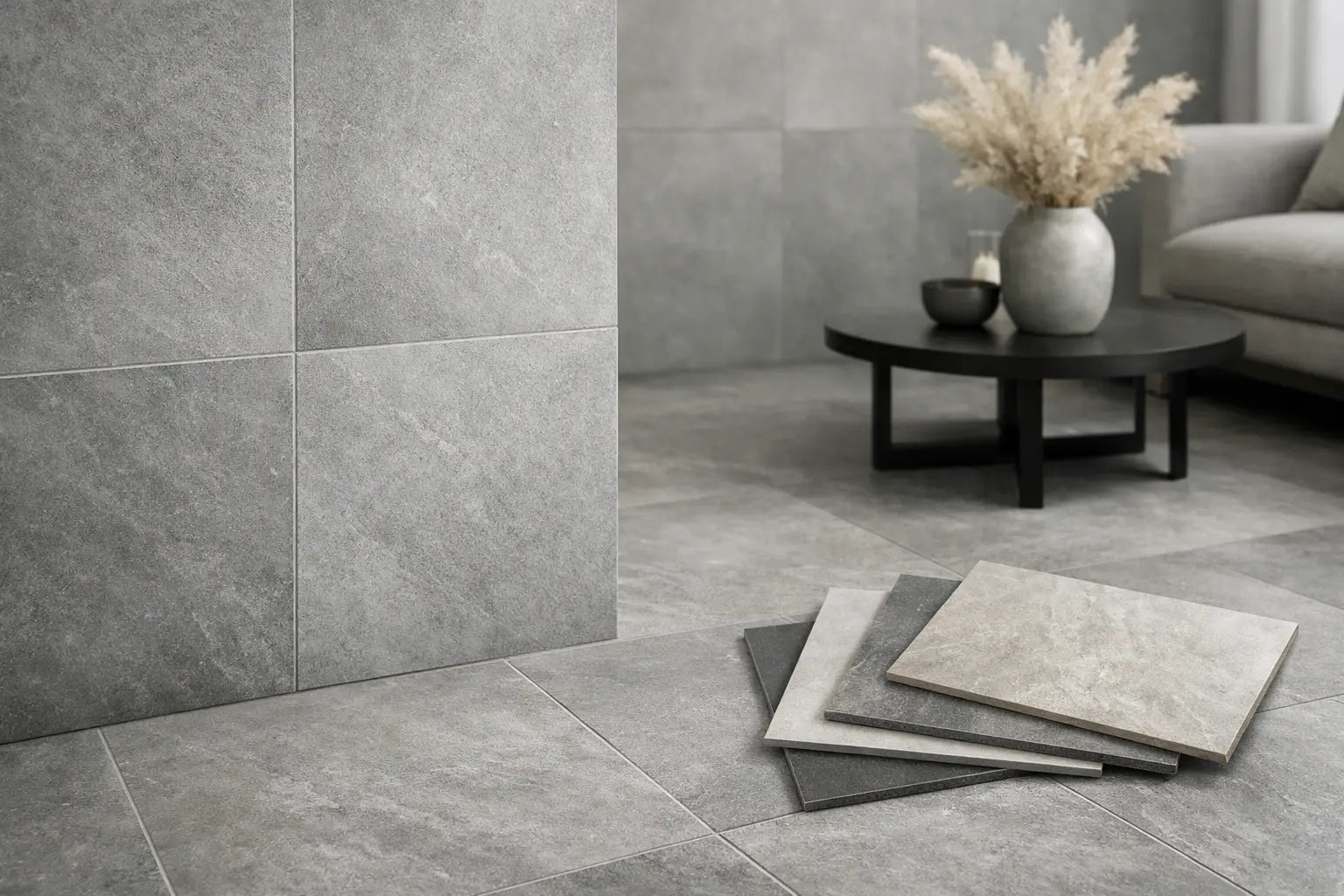
Light grey porcelain is often used where brightness is a priority. It suits smaller bathrooms, en suites and kitchens where you want a clean finish without the maintenance concerns of a pure white tile. Mid grey is probably the most versatile point in the range. It hides everyday marks better than very pale shades and still keeps the room feeling open. Dark grey and anthracite tones create a premium, grounded look, especially in larger open-plan interiors, but they benefit from good lighting and often work best when balanced with lighter walls, joinery or furnishings.
Finish matters as much as colour
A common mistake is choosing by colour first and finish second. In practice, finish has a major impact on both appearance and performance.
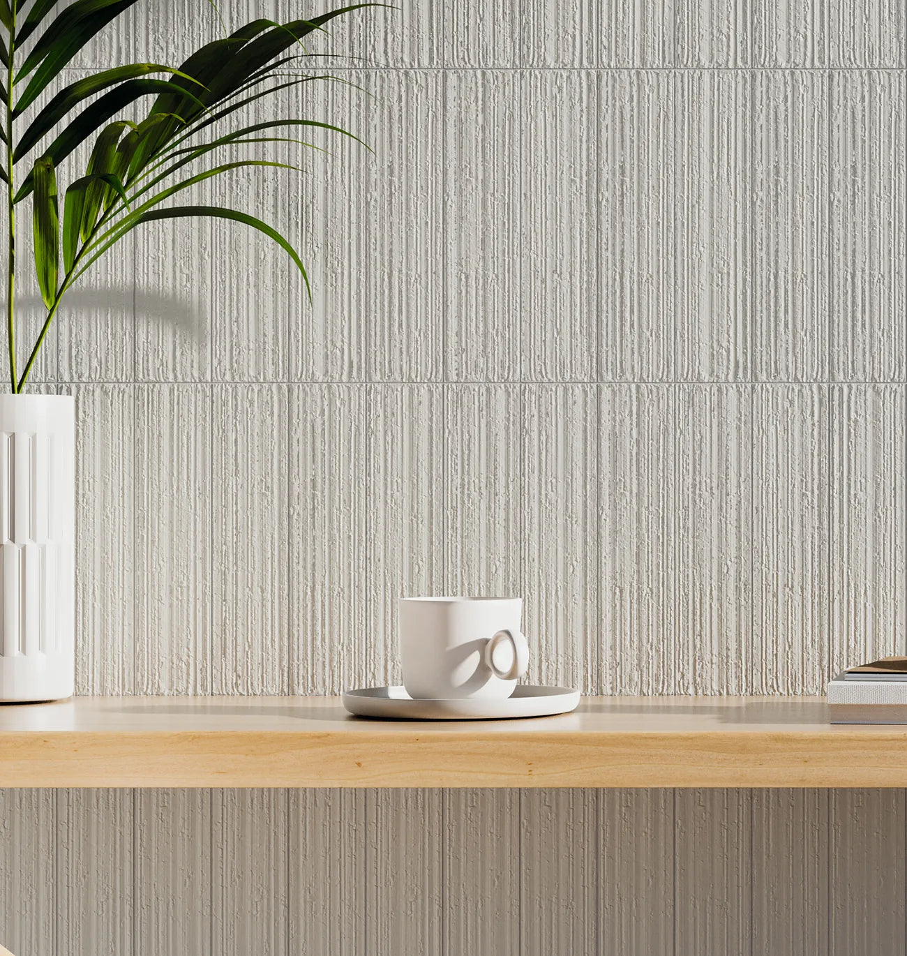
Matt grey porcelain tiles are a strong all-round choice. They tend to look more natural, especially in stone-effect or concrete-effect designs, and they are often preferred for floors because they provide a more understated, contemporary surface. They also tend to disguise water spots and general day-to-day dust better than polished finishes.
Polished grey porcelain can look striking and more formal, particularly on walls or in larger, light-filled spaces. It reflects light well and can help a room feel more luxurious. The trade-off is that polished surfaces usually show smears, splashes and general wear more readily, and they are not always the best fit for busy family floors or wet areas where slip resistance is a consideration.
Structured or textured finishes can be useful in entrance areas, shower zones or commercial settings where added grip matters. They bring a more tactile appearance too, although they can be slightly more involved to clean than a smoother tile. There is no universal best option - only the finish that best matches the room and how it will be used.
Popular styles within grey porcelain wall and floor tiles
Grey porcelain is not a single look. It covers a wide spectrum of styles, and the pattern or surface effect often determines whether the result feels minimal, classic or architectural.
Concrete-effect greys are popular for contemporary kitchens, bathrooms and open-plan living areas. They deliver an urban, design-led look without the sealing and maintenance demands associated with raw concrete. Stone-effect greys bring more movement and variation, making them suitable where you want a softer, more organic surface. Marble-effect grey porcelain offers a more decorative finish and works particularly well on bathroom walls, feature areas and elegant commercial interiors.
For period properties or more traditional homes, a grey tile with subtle variation or a limestone-inspired finish can bridge the gap between old and new. For hospitality or retail settings, large-format grey porcelain with minimal joints often gives the cleanest, most professional presentation.
Tile size and layout
Large-format grey tiles can make a room feel more expansive because there are fewer grout joints breaking up the surface. They are particularly effective in bathrooms, kitchen floors and open-plan spaces where a calm visual flow is important. However, very large tiles are not always the easiest option in smaller or awkwardly shaped rooms, especially where there are multiple cuts around sanitaryware, corners or thresholds.
Smaller formats can bring more rhythm and detail. They may suit feature walls, shower areas or spaces that need a little more texture. Layout direction also plays a role. A rectangular grey tile laid horizontally can visually widen a room, while the same tile used vertically may help emphasise height.
Practical considerations before you buy
The best tile choice is one that works on site as well as on a mood board. For floor applications, check the tile is suitable for the expected foot traffic and that the finish is appropriate for the room. For bathrooms and utility spaces, slip resistance and ease of cleaning should be considered alongside appearance.
Grout colour is another detail that makes a noticeable difference. A matching grey grout creates a quieter, more continuous look. A contrasting grout will define each tile and can become a design feature in its own right. Neither is wrong, but the result will feel very different.
Quantity planning also matters. Ordering the right coverage, with a sensible allowance for cuts and wastage, helps avoid delays and batch variation issues later. For more complex layouts, diagonal patterns or larger commercial jobs, getting the numbers right from the start can save both time and cost.
It also makes sense to think beyond the tiles themselves. Adhesives, levelling systems, trims, boards, waterproofing and suitable grout should all be selected as part of the same project plan. That is often where specialist support becomes valuable, particularly when a job has multiple areas, tight timescales or a finish standard that needs to be protected.
Where grey porcelain tiles perform best
Bathrooms are the most obvious fit, especially when you want a finish that feels current but not trend-led. Grey works well with white sanitaryware, timber furniture and both warm and cool metal finishes. In kitchens, grey porcelain offers a practical floor surface that can cope with regular traffic while complementing everything from shaker cabinetry to more minimalist handleless designs.
Hallways and utility rooms also benefit. These are hard-working areas where durability matters, and grey tends to be forgiving in everyday use. In commercial interiors, from hospitality spaces to washrooms and reception areas, grey porcelain delivers a clean, specification-friendly finish that reads as professional and durable.
For customers comparing options, Smart Tiles often sees grey porcelain chosen because it reduces risk. It is easier to build a complete scheme around, easier to maintain than many natural materials, and available in formats and finishes that suit both style-led residential projects and demanding commercial environments.
Making the final choice with confidence
If you are narrowing down grey porcelain wall and floor tiles, the strongest approach is usually to start with the room rather than the trend. Consider the light, the scale, the level of use and the mood you want the space to carry. Then match colour, finish and format to that brief.
A soft matt stone-effect grey may be right for a family bathroom. A large-format concrete-effect tile may suit an open-plan kitchen extension. A refined marble-effect grey could be exactly what a boutique commercial washroom needs. The right answer is rarely the most dramatic option - it is the one that still feels right once installed, furnished and used every day.
Good tiles should do more than look right on a sample board. They should support the way a space performs, hold their appearance over time and make the specification process feel clearer, not more complicated. That is usually where the best decisions are made.