Article: Decorative Wall Tiles for Kitchen Choices
Decorative Wall Tiles for Kitchen Choices
A kitchen rarely needs more decoration. It needs better surfaces. When you are choosing decorative wall tiles kitchen schemes depend on, the right decision is not just about pattern or colour. It is about how the wall finish works with cabinetry, lighting, worktops, splashback zones and the level of day-to-day use the room will see.
Decorative wall tiles can sharpen a contemporary layout, soften a classic shaker kitchen or introduce contrast into a restrained palette. They also need to clean easily, install neatly and continue to look considered once the room is fully dressed with appliances, shelving and accessories. That balance between design impact and practical performance is where good tile selection starts.
What decorative wall tiles bring to a kitchen
In a kitchen, decorative tiles do more than fill a blank wall. They create focal points, frame cooking areas and add surface texture that paint simply cannot match. This is especially useful in open-plan homes, where the kitchen often needs to hold its own visually against dining and living spaces.
The most successful decorative wall tiles for kitchen projects usually do one of three things well. They introduce movement through pattern, depth through texture, or warmth through tone. A gloss handmade-look tile can bounce light around a darker room, while a matt patterned porcelain can ground a larger kitchen with a more architectural feel.
There is also a practical advantage. Tiled surfaces are easier to maintain around hobs, sinks and preparation zones than painted plaster. That does not mean every kitchen wall should be fully tiled. Often, a more selective application looks smarter and feels more current.
Decorative wall tiles kitchen buyers should consider first
Before narrowing down collections, it helps to look at the room in a more technical way. Decorative tiles may be visually led, but they still need to suit the scale and function of the space.
Room size and natural light
Smaller kitchens often benefit from decorative tiles used with restraint. A busy encaustic-look pattern across every wall can make the room feel crowded, while a feature run between base and wall units can add interest without closing the space down. In larger kitchens, stronger designs are easier to carry, particularly where there is plenty of daylight and generous wall area.
Light matters just as much as size. Gloss and lightly reflective finishes can lift a north-facing kitchen, while richly toned matt tiles tend to work best where the room already has strong natural or layered artificial lighting.
Cabinetry, worktops and hardware
Tiles should be chosen as part of the full specification, not in isolation. If cabinetry is heavily grained timber or strongly coloured, the wall tile often needs to be calmer. If units are plain and understated, decorative tiles can do more of the visual work.
Worktop material also influences the decision. A dramatic stone surface with bold veining may pair better with a simple fluted or handmade-effect wall tile than a competing graphic pattern. Brass, black and stainless hardware will all shift how tile colours read once installed.
Cleaning and maintenance
This is where product knowledge matters. Deeply textured tiles can look excellent, but behind a hob they may need more frequent cleaning than a smoother glazed surface. Crackle glazes, natural stone looks and pronounced relief finishes each have their place, but the installation method, grout choice and maintenance expectations should be clear from the outset.
For many domestic kitchens, ceramic wall tiles are a strong choice where the goal is a decorative finish on vertical surfaces without unnecessary complexity. In heavier-use commercial or hospitality environments, porcelain may be preferred where additional durability and broader application flexibility are required.
Choosing the right decorative style
Decorative does not have to mean loud. In many high-end kitchens, the most effective decorative tile is subtle enough to reward a closer look rather than dominate the room immediately.
Handmade and zellige-look tiles
These remain a popular choice because they bring variation in tone, edge and surface reflection. They suit shaker kitchens, pared-back contemporary spaces and schemes where the aim is warmth rather than formality. Their appeal lies in irregularity, but that also means shade variation should be expected and planned for across the area.
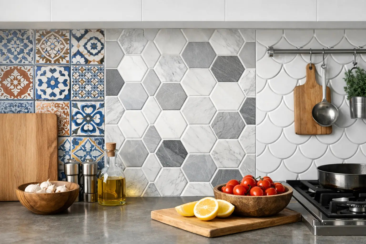
Patterned and encaustic-look designs
These are useful where the wall needs a stronger focal point. They can work particularly well in splashback panels, breakfast nook walls or behind open shelving. The key is control. A patterned tile often looks best when surrounding finishes are quieter, so the scheme feels intentional rather than overworked.
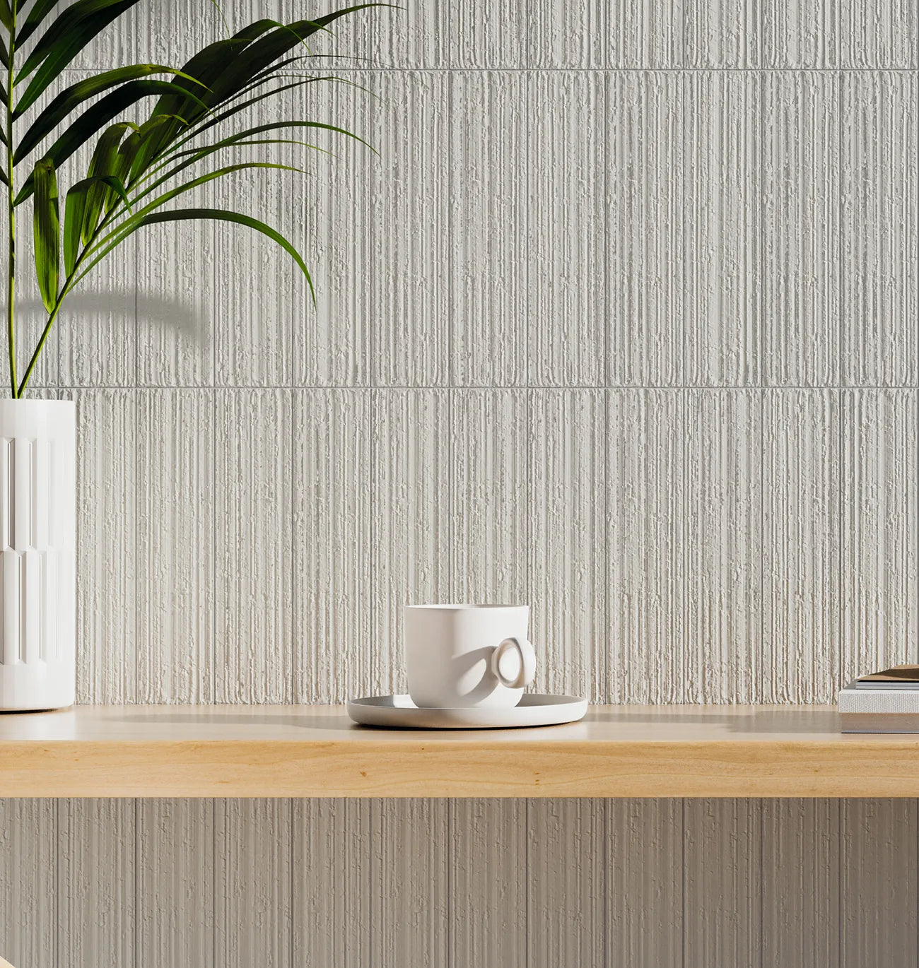
Textured and relief tiles
Fluted, ridged and three-dimensional wall tiles add depth without relying on busy pattern. They are especially effective in modern kitchens where tonal palettes dominate and the design needs surface interest through light and shadow. As always, location matters. A relief tile away from direct splashes is often easier to live with.
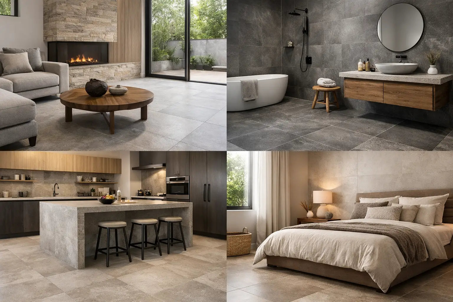
Stone-effect and decorative neutrals
Not every decorative kitchen tile needs ornament. Soft stone-effect walls, linear textures and tonal variation in warm neutrals can provide a decorative finish with a calmer, more timeless result. For many premium renovations, this is the better long-term choice.
Layout decisions that change the final look
The same tile can feel traditional, contemporary or more bespoke depending on how it is laid. This is often underestimated at buying stage.
Brick bond is familiar and versatile, especially for metro and handmade-look tiles. Vertical stacking feels cleaner and more architectural, and it can help draw the eye upward in rooms with lower ceilings. Herringbone introduces movement and tends to suit feature areas rather than large full-wall applications.
Tile size is equally important. Small-format decorative tiles can create beautiful detail, but they also introduce more grout lines. Larger formats reduce visual interruption and can make a kitchen feel more expansive, though they may lose some of the handcrafted character people want from decorative wall finishes.
Grout colour deserves proper attention. Matching grout gives a quieter, more seamless appearance. Contrasting grout highlights shape and layout, which can be effective, but it needs confidence and precision. In a premium kitchen, poor grout selection can undermine a good tile choice surprisingly quickly.
Practical buying points for decorative wall tiles kitchen projects
A kitchen wall tile should never be selected on appearance alone. Samples are essential because online images and showroom displays cannot fully replicate the lighting conditions in your own space. A tile that looks soft grey in one setting may read much warmer or cooler at home.
You also need to calculate quantities carefully. Decorative ranges can involve batch variation, and running short part way through installation is an avoidable risk. Allowing for cuts, wastage and future repairs is sensible, particularly on patterned or shade-varied products where continuity matters.
It is also worth checking what else the project requires beyond the tiles themselves. Adhesive choice, grout specification, trims, edge details, backing boards and sealants all affect the quality of the finished installation. For trade buyers and homeowners alike, sourcing everything together reduces delays and avoids compatibility issues on site.
Smart Tiles supports this part of the process well because selection, samples, coverage planning and installation materials can be handled together rather than pieced together across multiple suppliers.
When less decorative is actually the better choice
There are kitchens where a decorative wall tile is not the strongest answer. If the cabinetry already includes ornate detailing, if the worktop has heavy movement, or if the room is visually busy due to open shelving and mixed finishes, a simpler wall tile may produce a more premium result.
This is not a compromise. Often, a pared-back ceramic or porcelain tile with a refined finish does more for the overall scheme than a pattern-led option trying to compete for attention. Decorative value can come from texture, glaze depth or proportion just as much as from motif.
That is particularly true in larger residential and commercial projects, where longevity matters. The tile should still feel right in five or ten years, not only on installation day.
Getting the specification right from the start
The strongest kitchen schemes are usually the ones that resolve practical questions early. Where will the tiling start and stop. How will external corners be finished. Will the splashback run beneath a hood or stop at shelf height. Does the tile need to align with worktop joints, cabinetry lines or window reveals.
These are not small details. They influence how polished the finished kitchen feels. Decorative wall tiles reward careful planning because every line, cut and transition is more visible when the surface is a design feature in its own right.
For homeowners, that means slowing the decision down just enough to compare samples against cabinetry and worktops in real light. For designers, contractors and specifiers, it means confirming suitability, quantities and fixing materials before the programme gets tight.
A decorative kitchen wall should earn its place. If the tile adds depth, suits the wider palette and performs well in the way the room is used, it will do far more than decorate. It will help the whole kitchen feel resolved.